Image
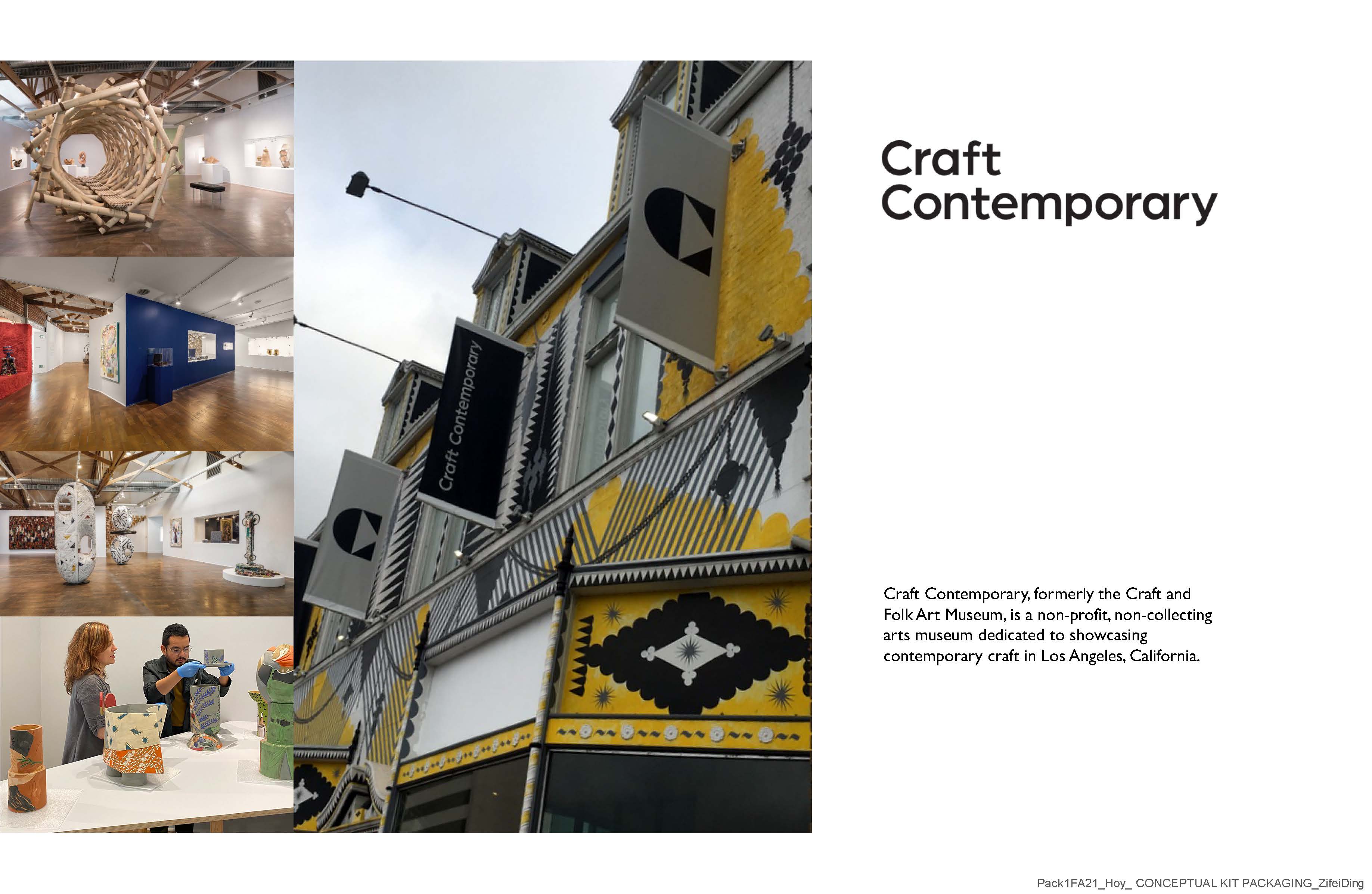
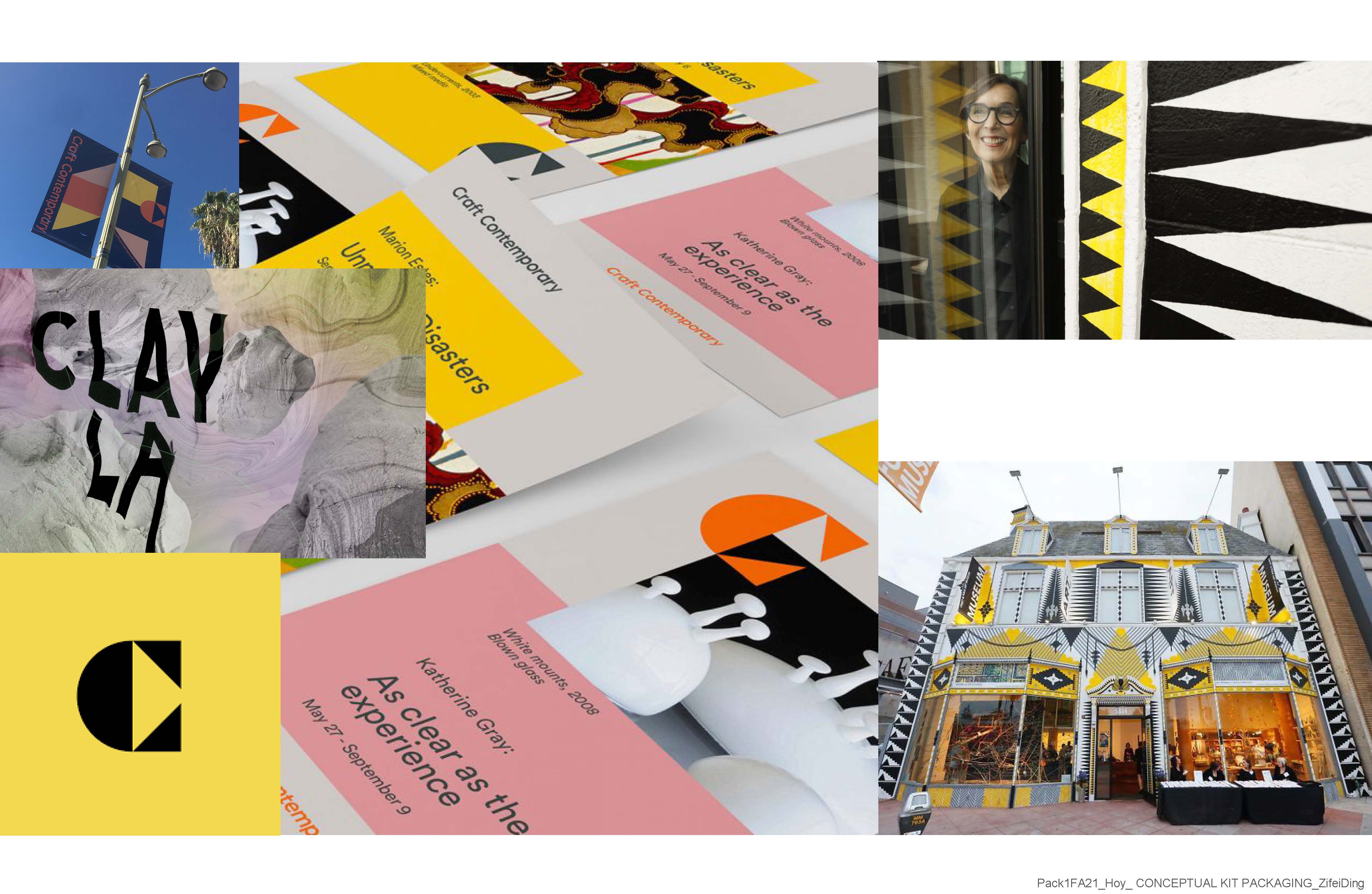
For this conceptual kit packaging project, my design concept is to use modular packaging itself. Different packaging can be stacked into different shapes to increase storage performance and playability. Craft Contemporary is a non-profit, non-collecting arts museum dedicated to showcasing contemporary craft in Los Angeles.
Image
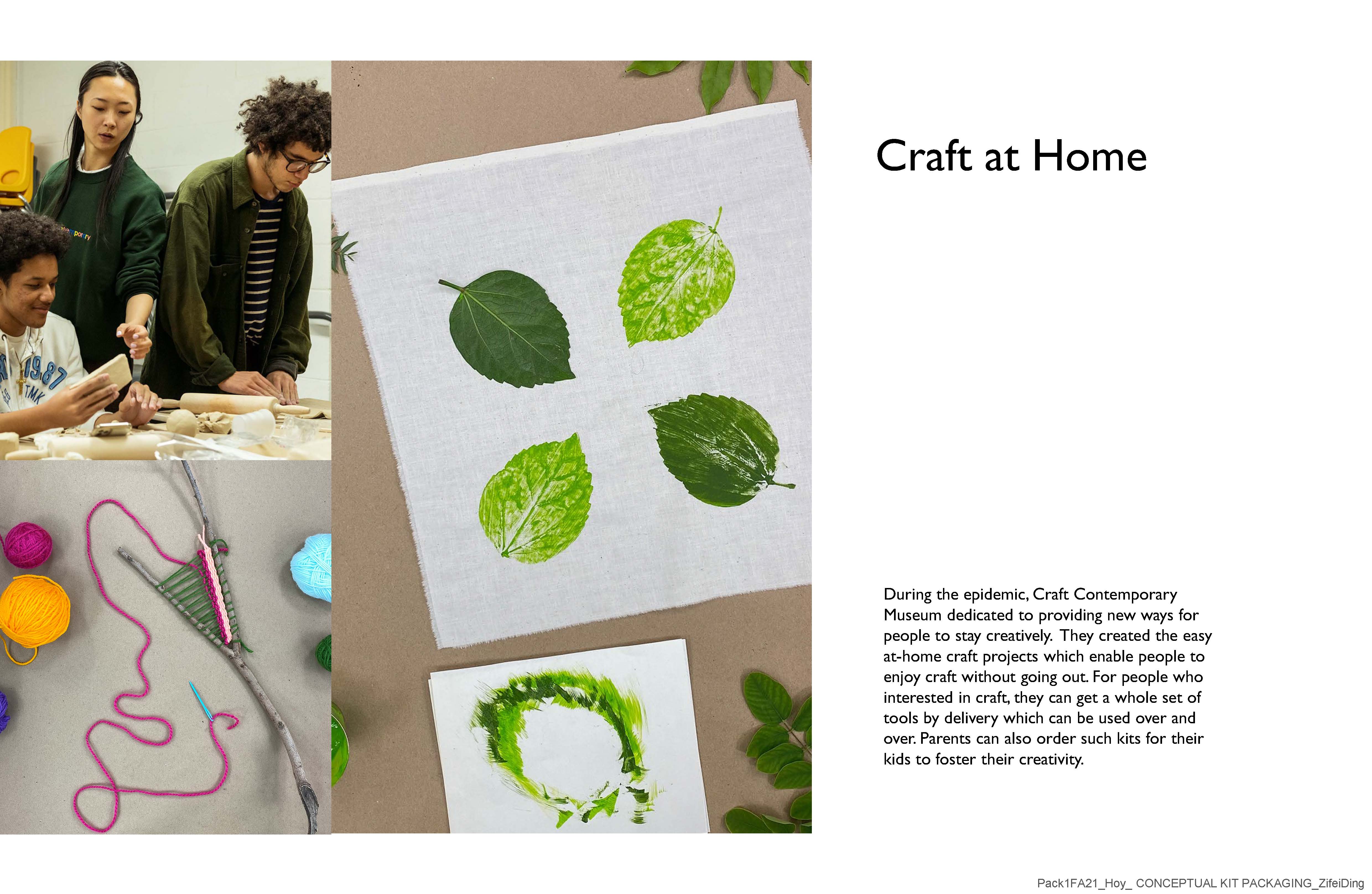
During the epidemic, Craft Contemporary Museum was dedicated to providing new ways for people to stay creative. They created easy at-home craft projects which enable people to enjoy craft without going out. But they only provide video tutorials and require viewers to purchase or find the materials themselves. So I think they should have a craft kit to go with this project. Provide tools to people who are willing to try and love art.
Image
I started my brainstorming session, which included the properties I felt a process toolbox needed to have.
Image
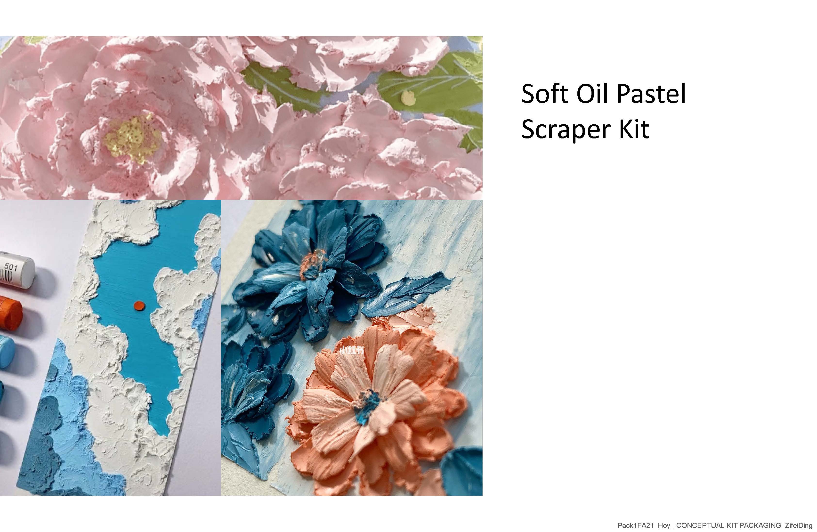
Finally, I think my sample kit is a soft oil pastel scraper kit, this is just an example, Craft Contemporary Museum can change the content of the instructional videos and craft kits according to their exhibition theme.
Image
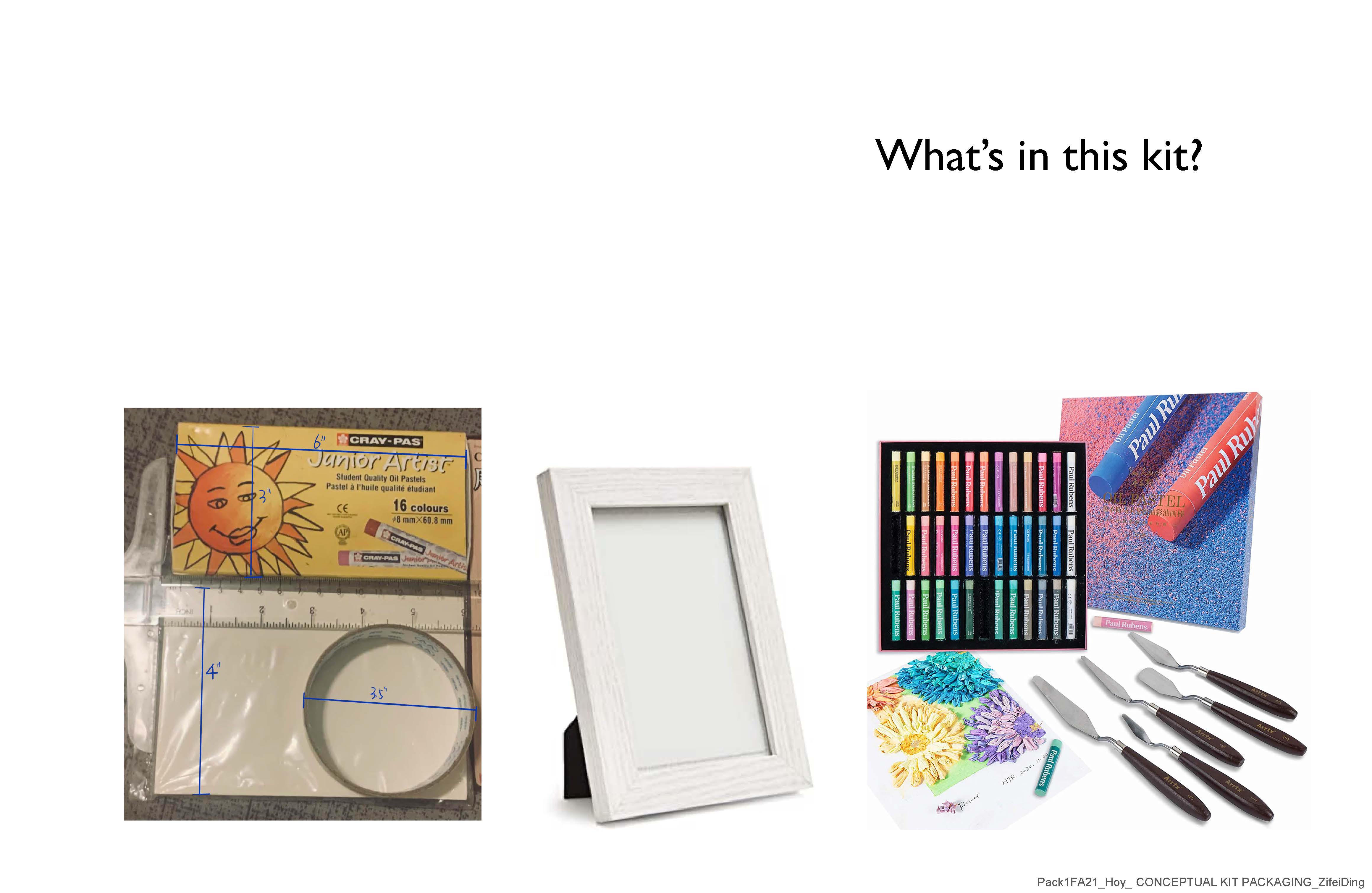
Here is what should be included in the soft oil pastel scraper kit This includes drawing paper, soft oil pastel, different scraper knives, and a frame to display the finished product. I purchased these items and measured them for size.
Image
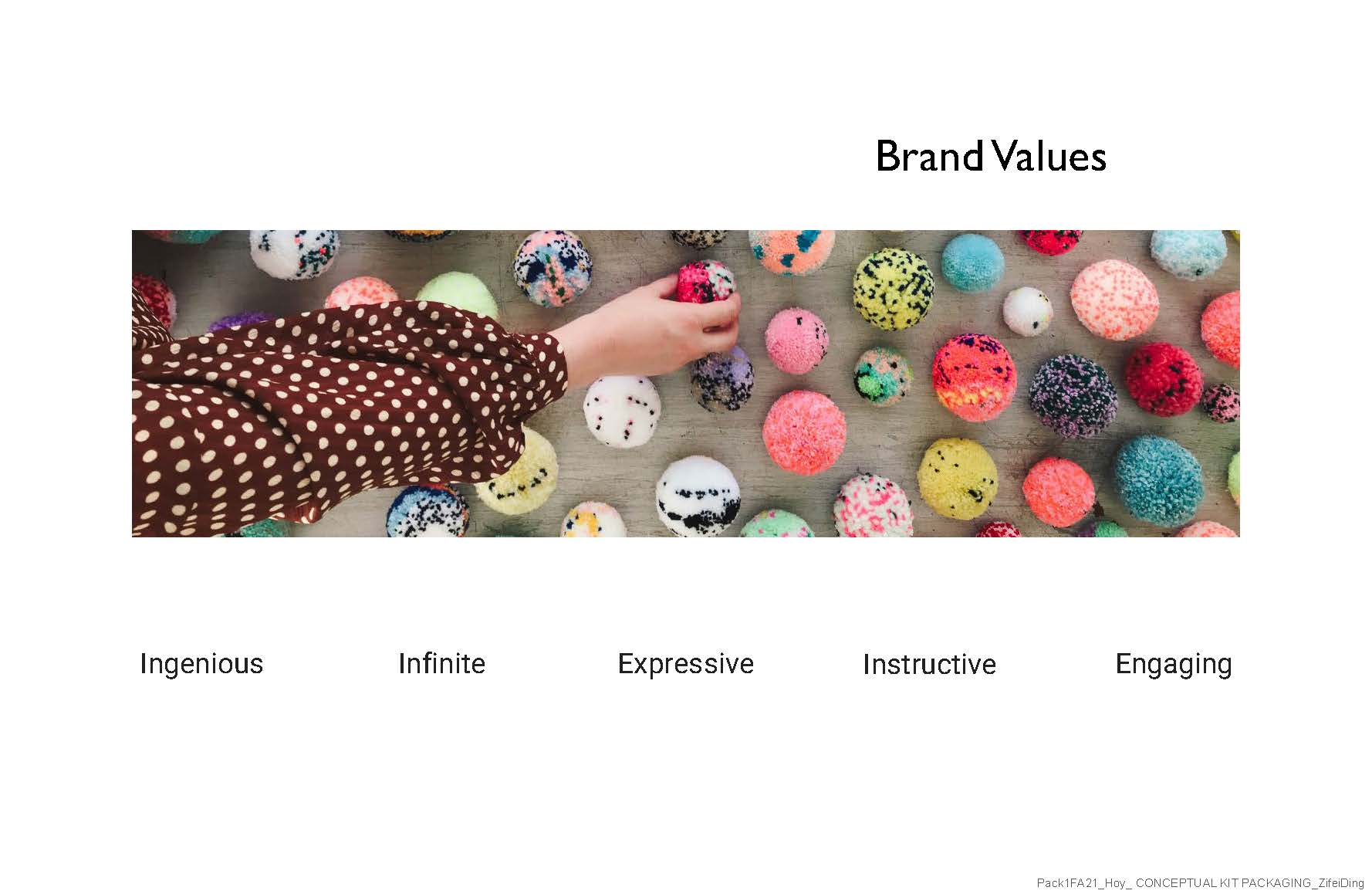
The next step is the analysis of the characteristics of this craft kit. Here I found five key words, which are ingenious, infinite, aggressive, instructive, and engaging. I think these are the words that describe the handcrafted art and the artist's character.
Image
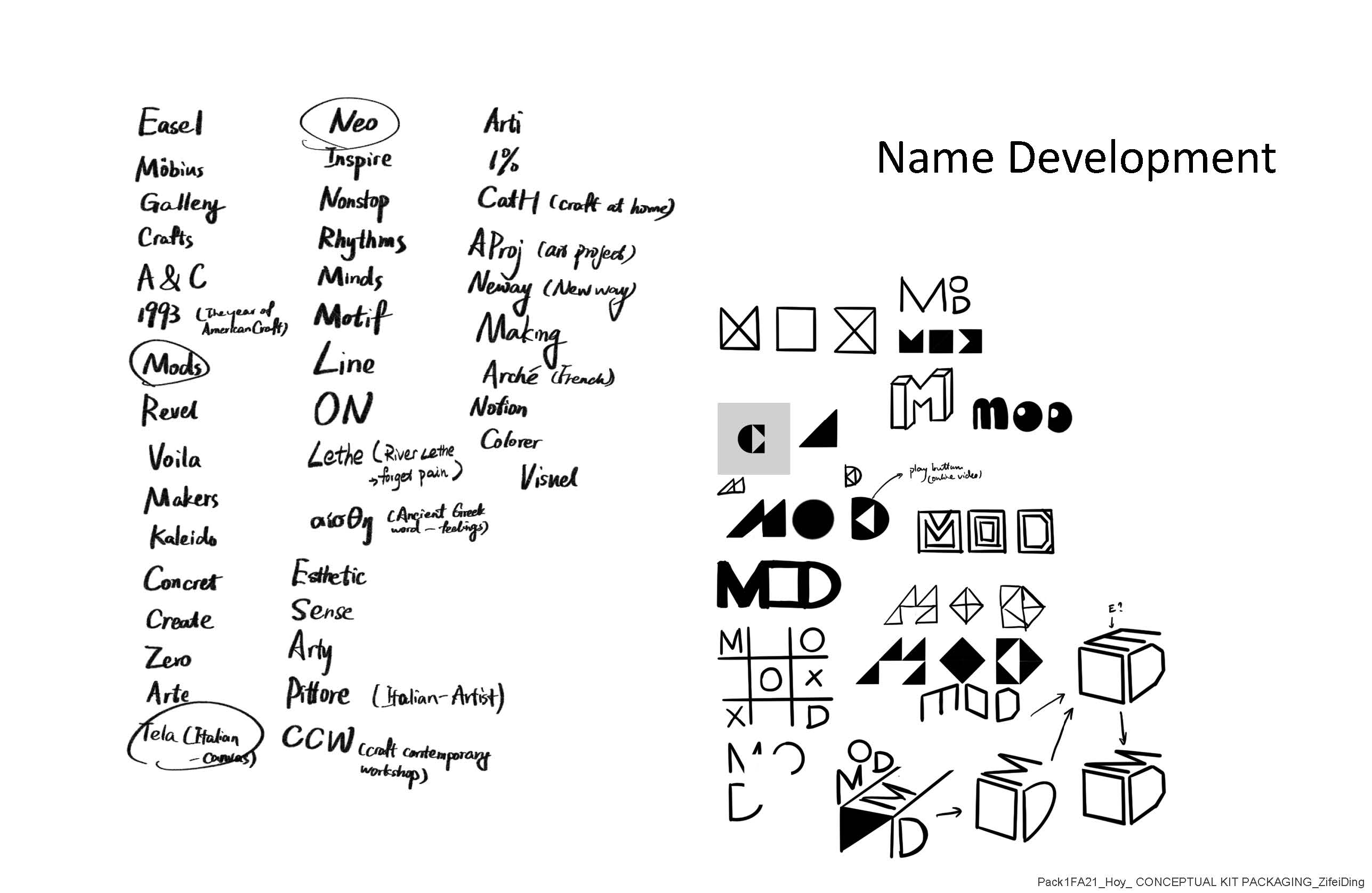
Based on these five keywords, I started to choose the name to give to this craft kit. These are some of the ideas that I wrote out. Finally, I chose mod as the name of my craft kit. Because for this series of kit packaging I want to use modular. Different packaging can be stacked into different shapes to increase storage and playability.
Image
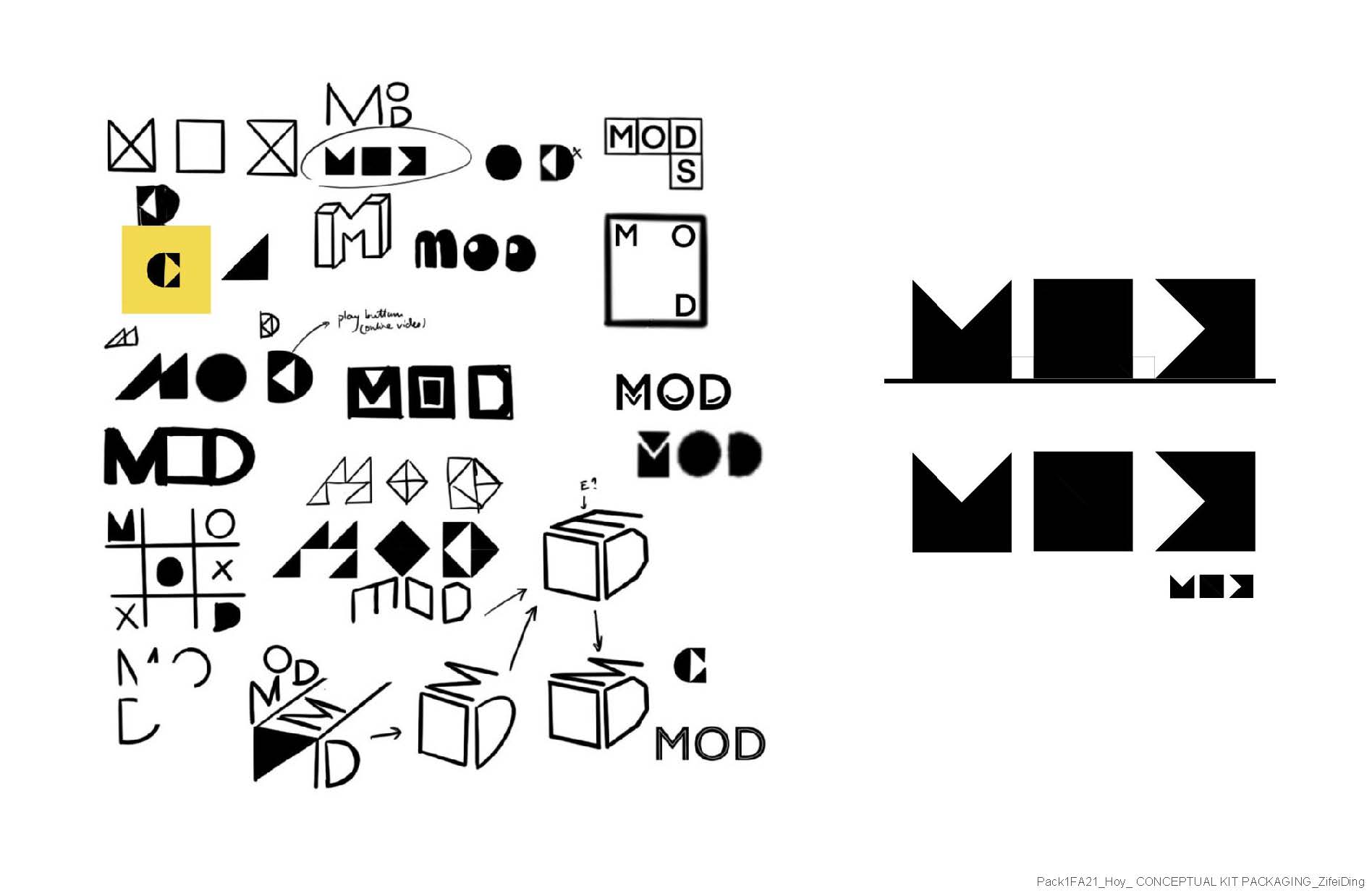
I tried a lot of sketches and finally chose to use the black triangle element from the Craft Contemporary Museum's own logo.
Image
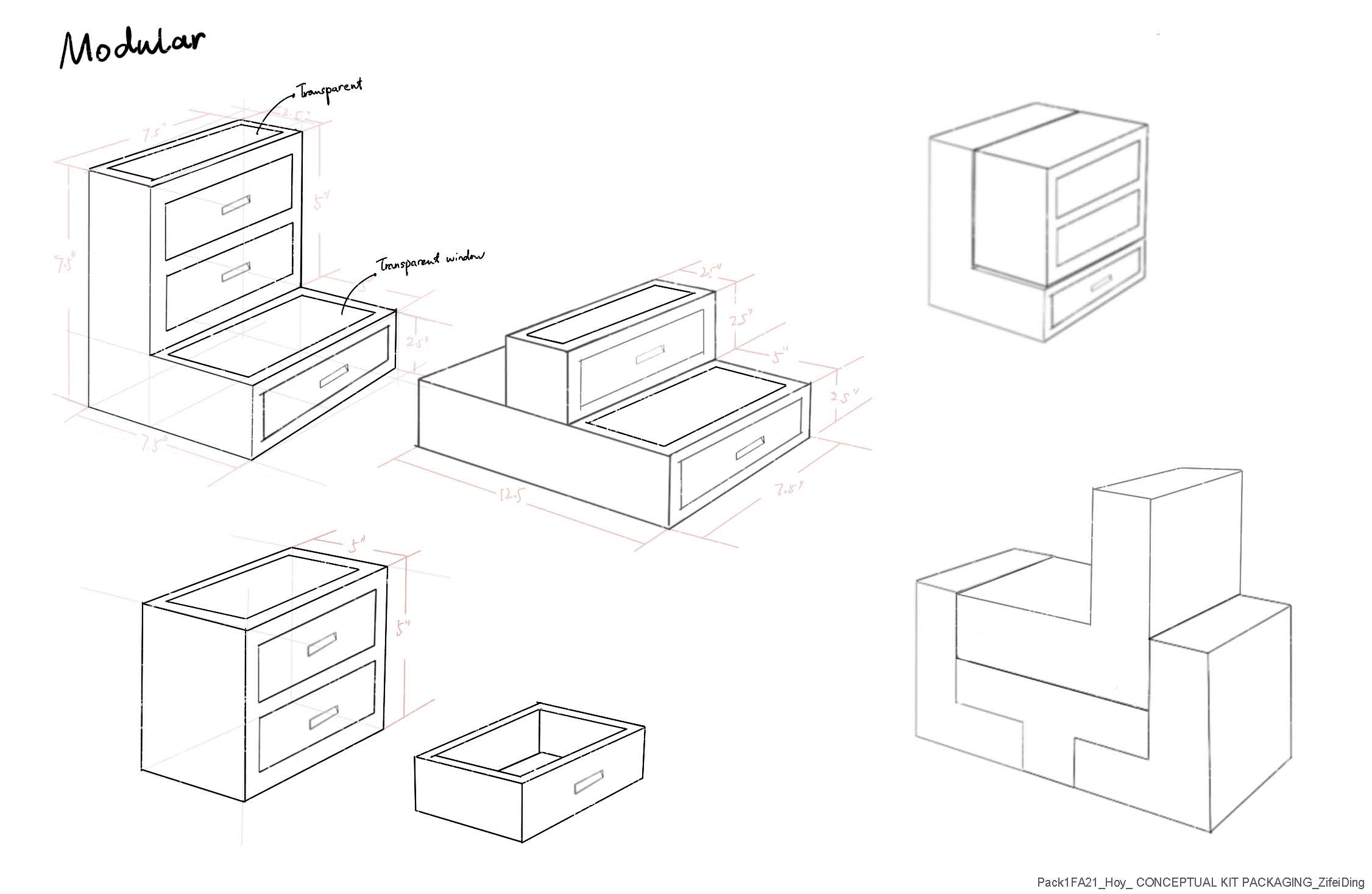
This is my sketch of the design, such a craft kit should have three different shapes so they can be stacked together. They also have the function of storage to prevent the loss of tools when people use them.
Image

Image
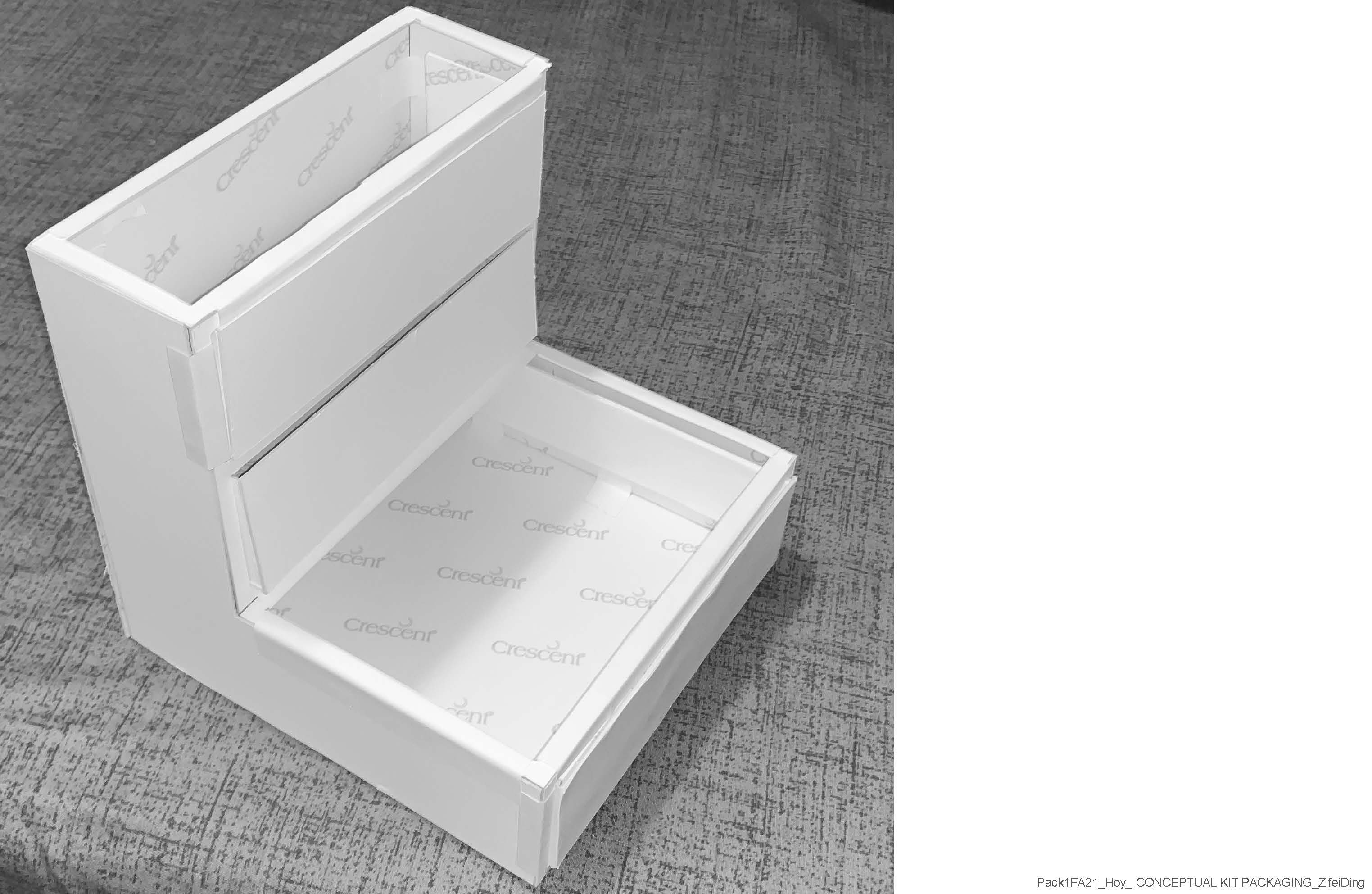
I tried to use art boards to build a model for this craft kit.
Image
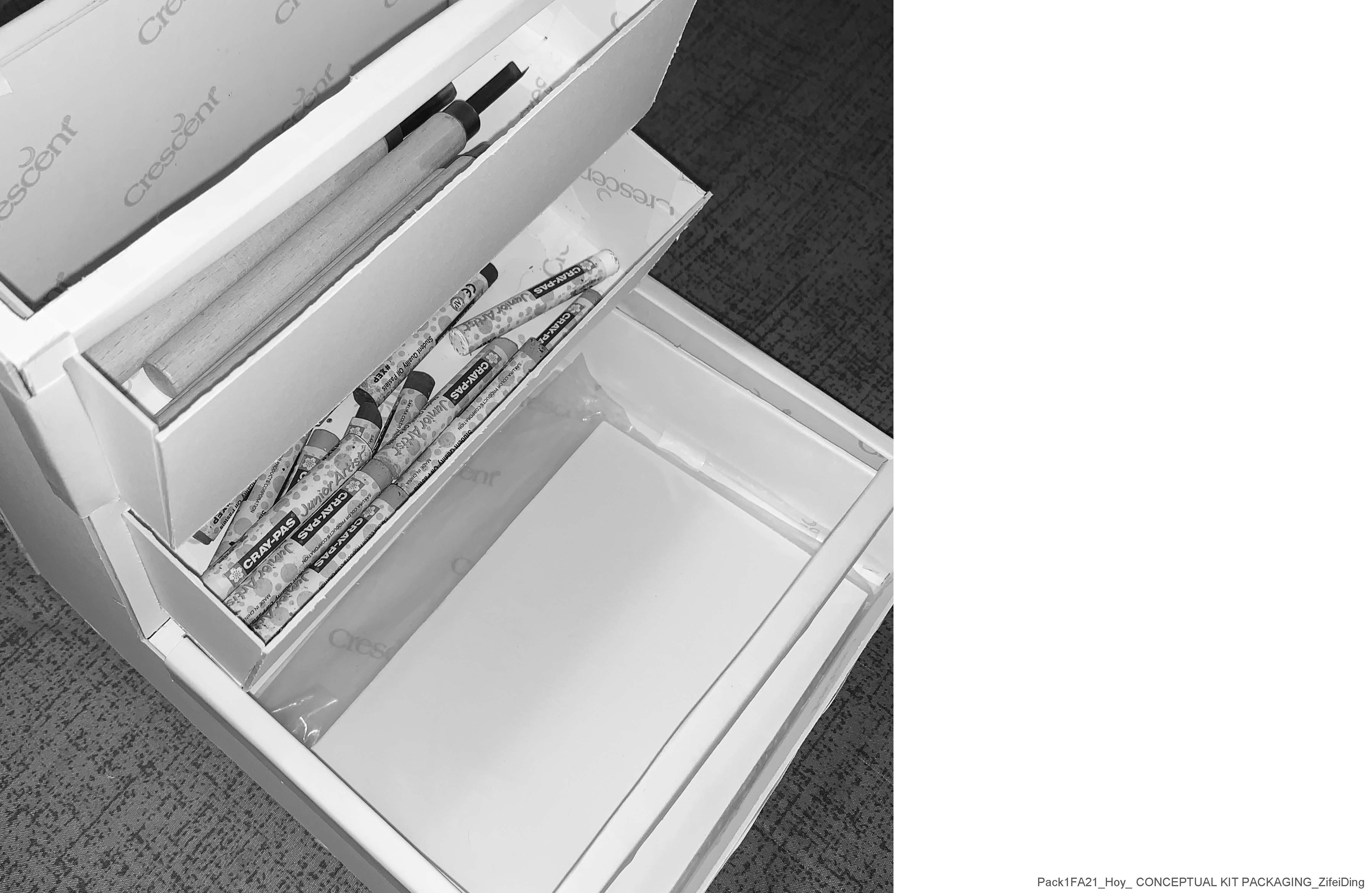
Then I will put the physical art-making tool into it to test the size.
Image
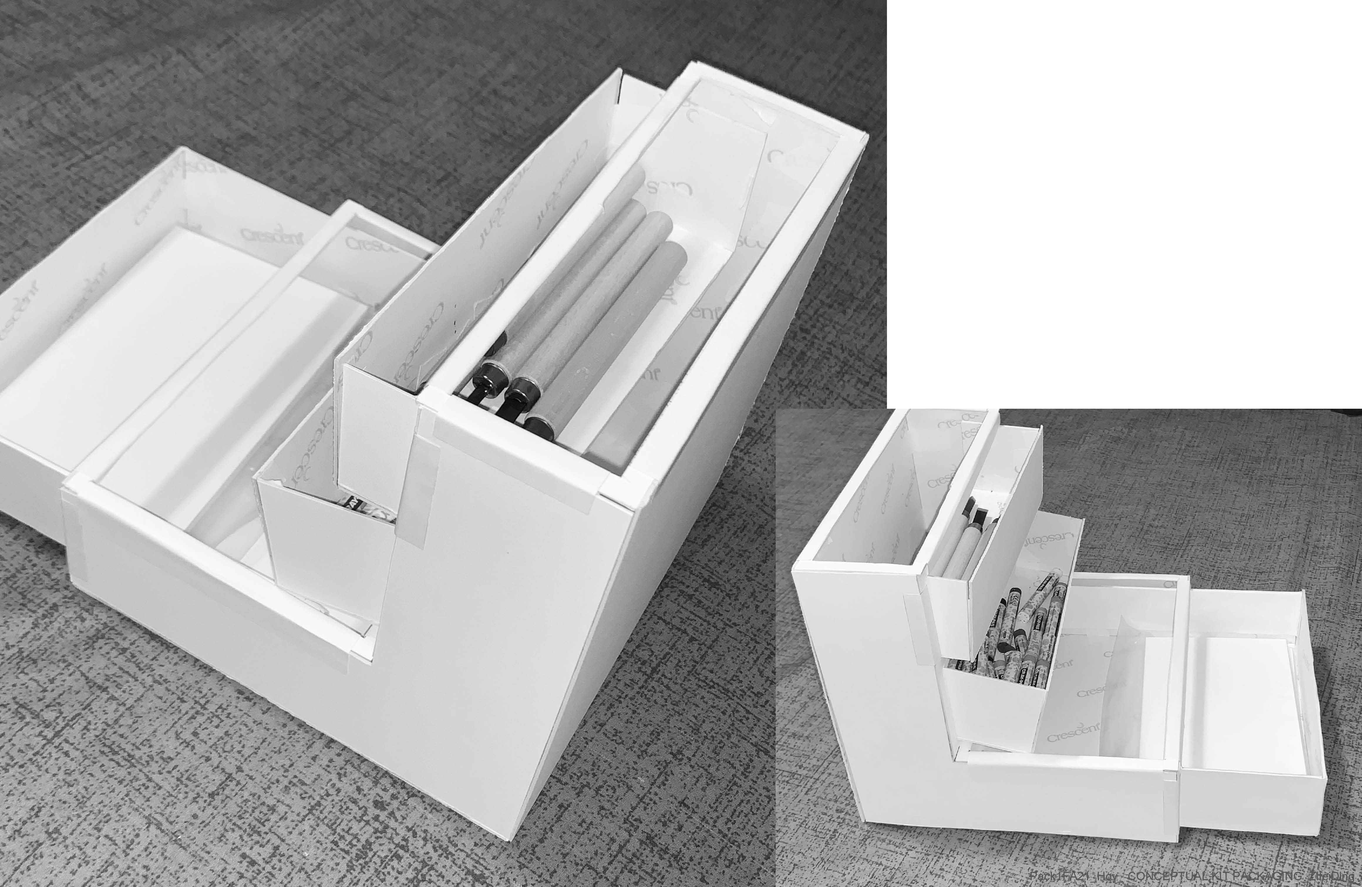
This is what it looks like from different angles.
Image
The next step was the design of the visual elements, and I created a mood board.
Image
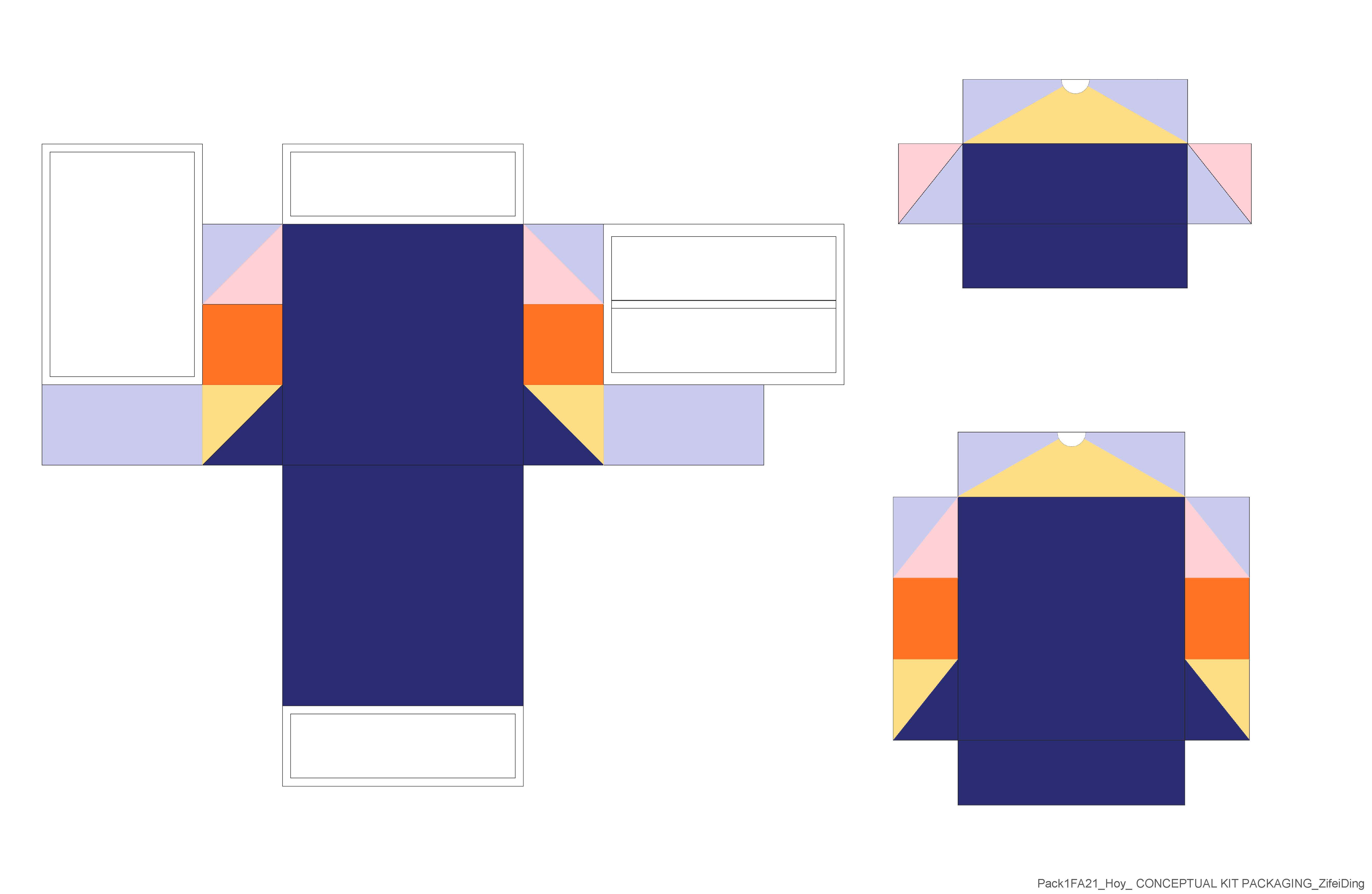
I then created the visual elements of the kit packaging, based on the thematic colors often used by Craft Contemporary Museum, as well as the triangles.
Image
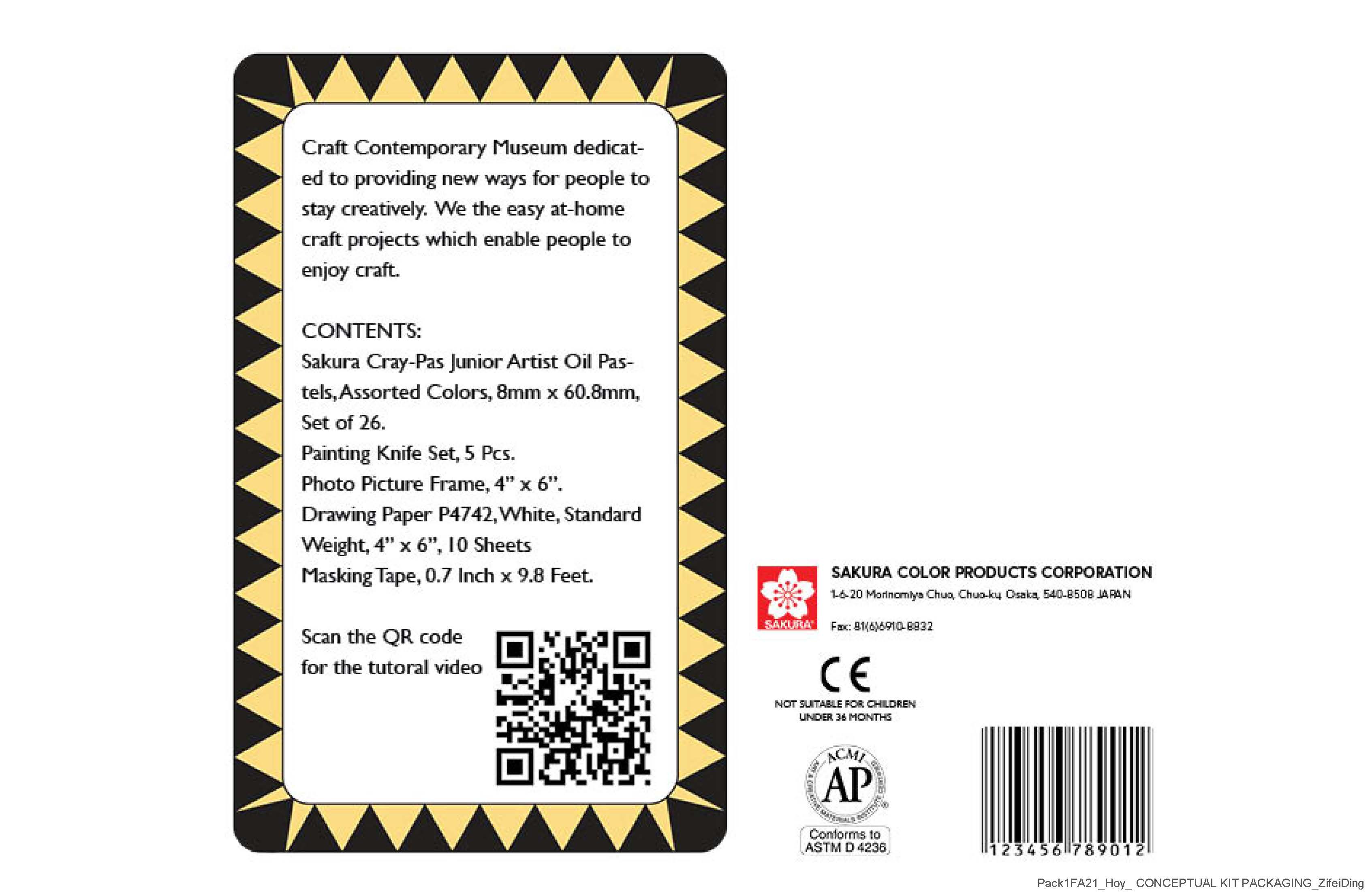
Then after a PDP analysis of many art tools, I made the first version of the pdp. It includes an introduction to the brand spirit of the Craft Contemporary Museum, what is included in this craft kit, and important logos like age restrictions and warnings and AP Seal.
Image
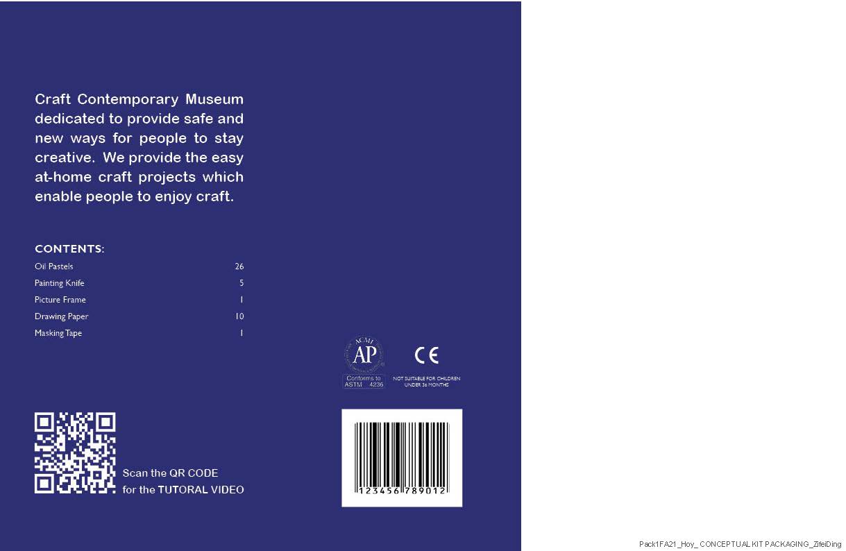
At the suggestion of my mentor, I made substantial changes to my typography. The layout of the second version became cleaner. Make the information look more concise and easy to understand.
Image

This is what it looks like after the logo is added as well as the pdp.
Image

Then I printed and glued it to my physical model. This is what the model looks like from different angles.
Image
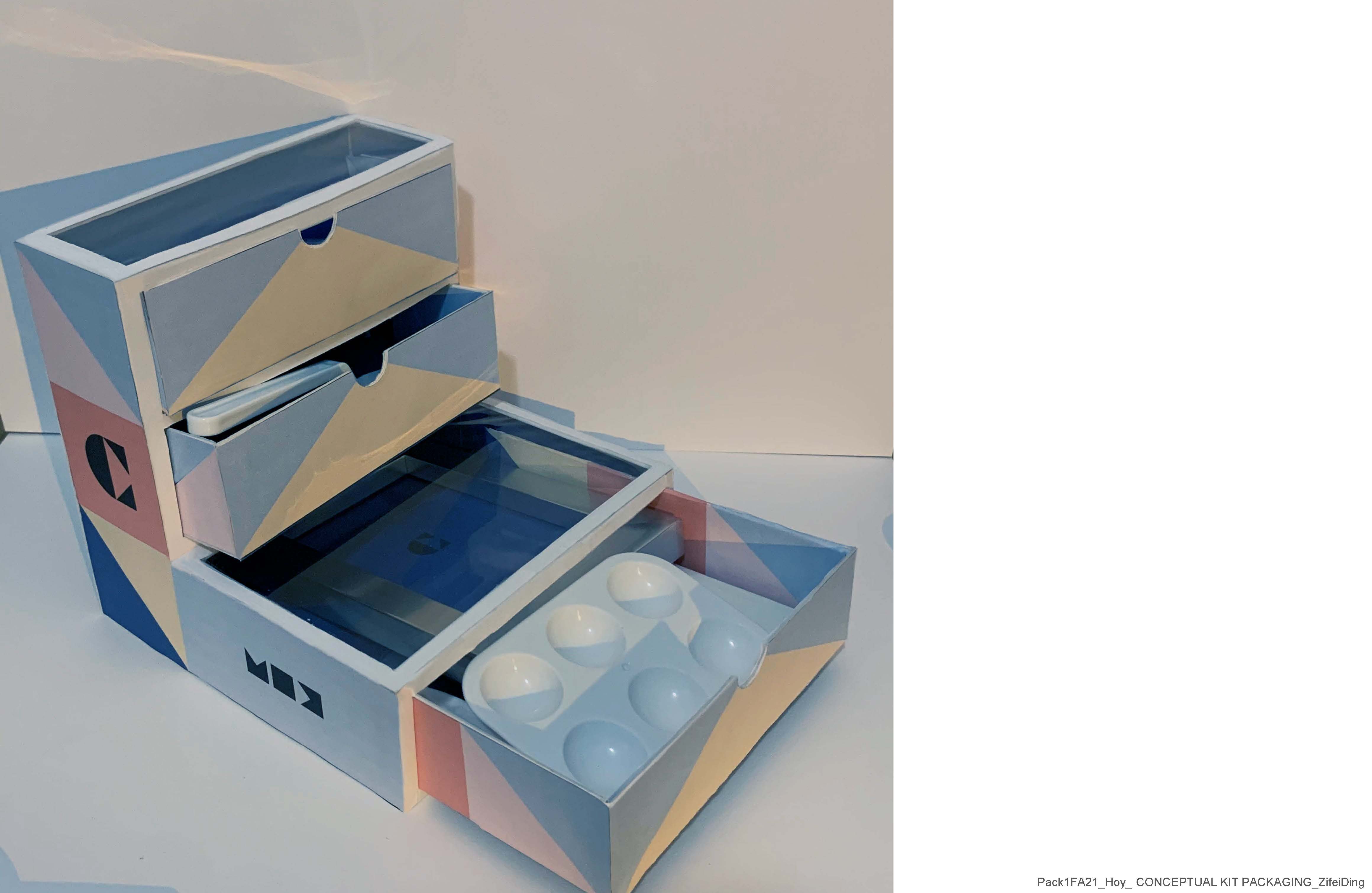
What it looks like after putting all the real tools into this craft kit.
Image
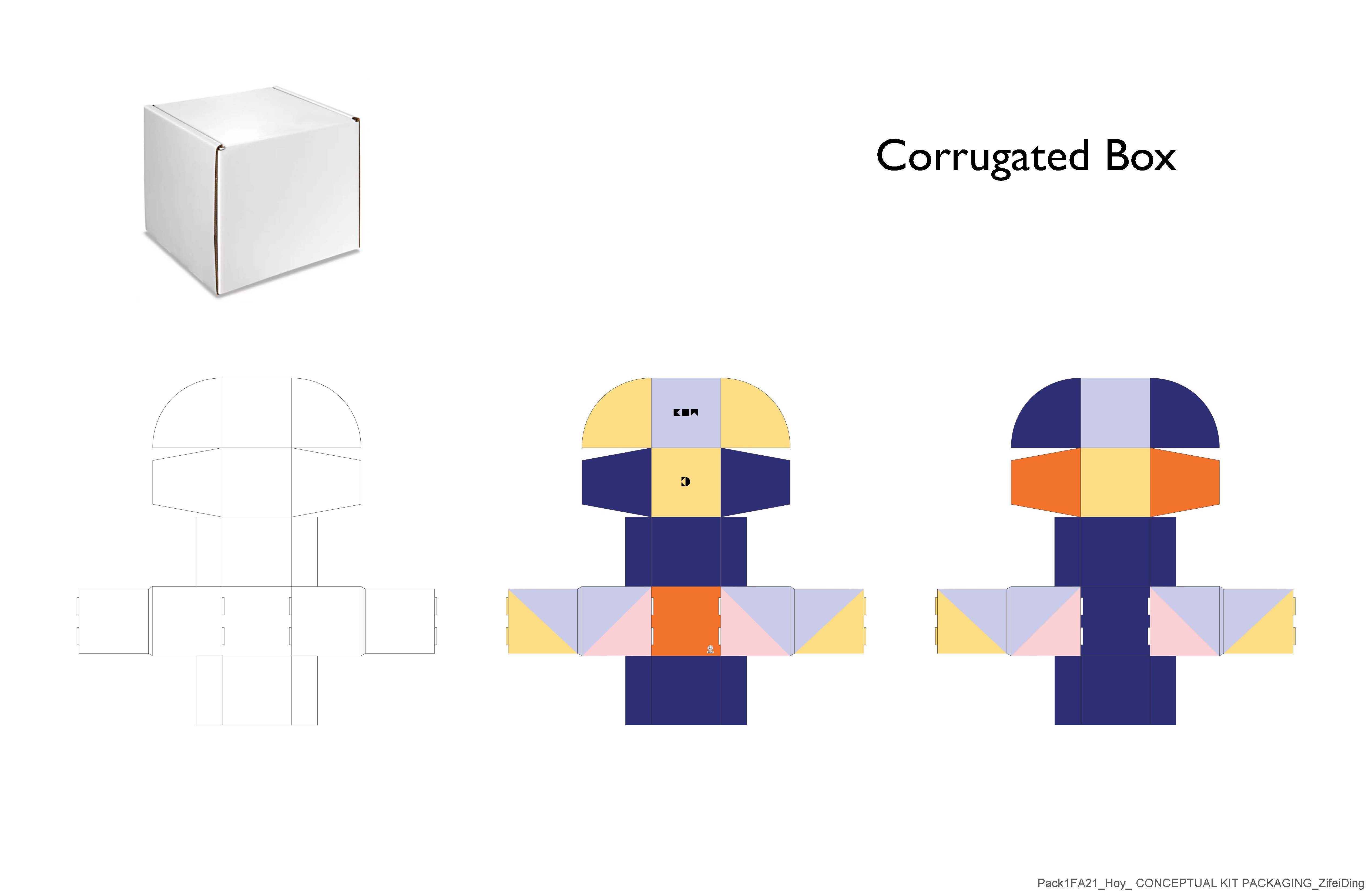
Since this is an at-home craft kit for making art, I decided it would be a monthly subscription item to purchase. This craft kit is to be delivered to the purchaser. So it also needs a courier package. This is the design for the corrugated box. the front and back of the corrugated box will be slightly different.
Image
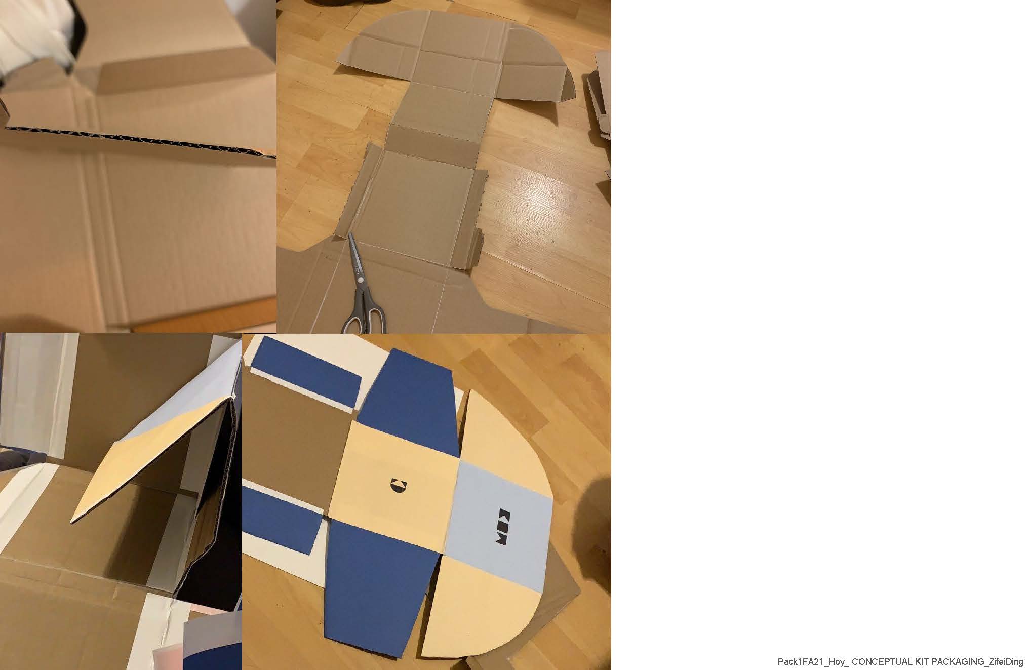
Then I used corrugate cardboard to make actual size corrugated box models. This is my working process.
Image
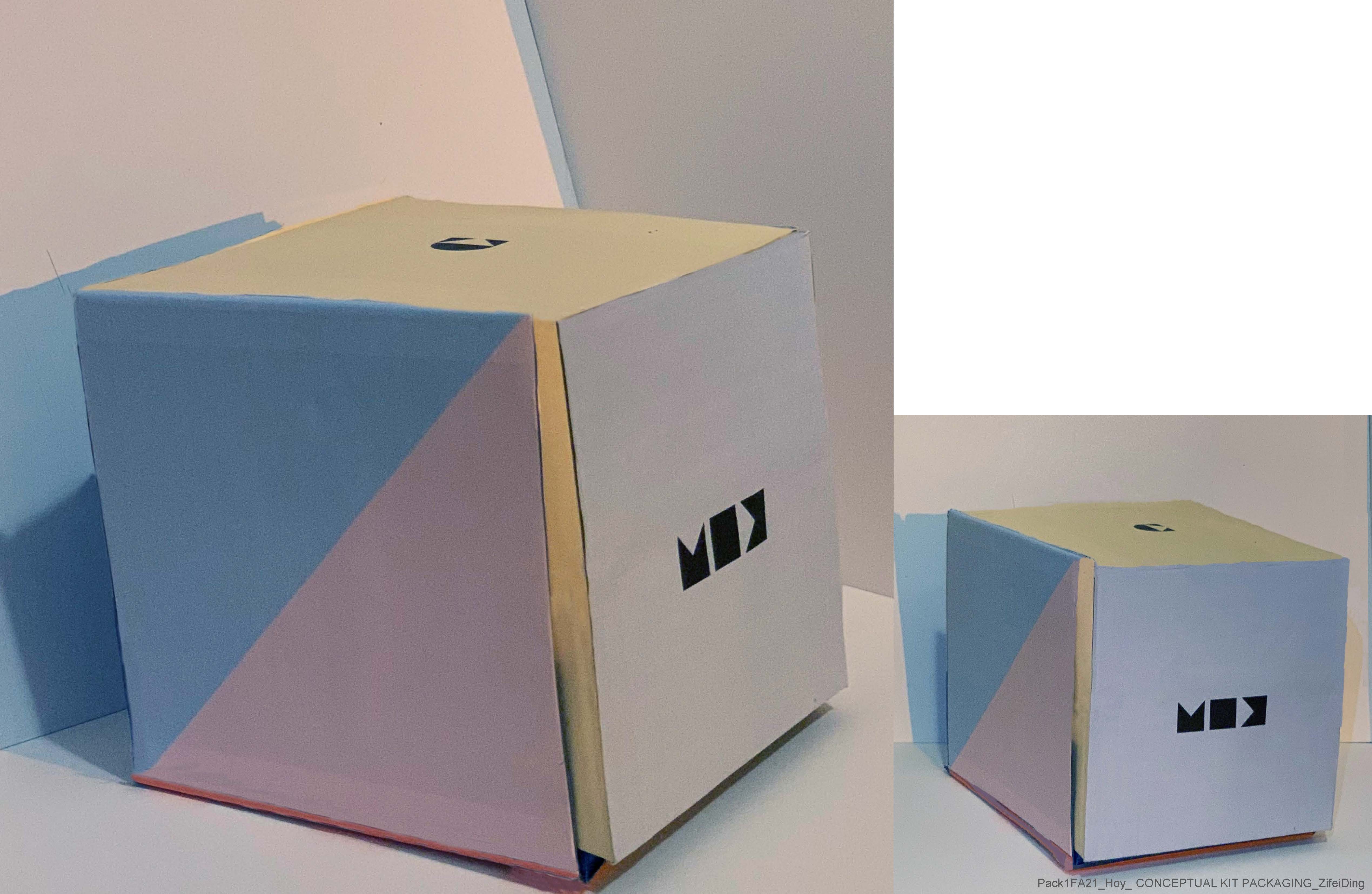
Then this is the corrugated box after the visuals are applied.
Image
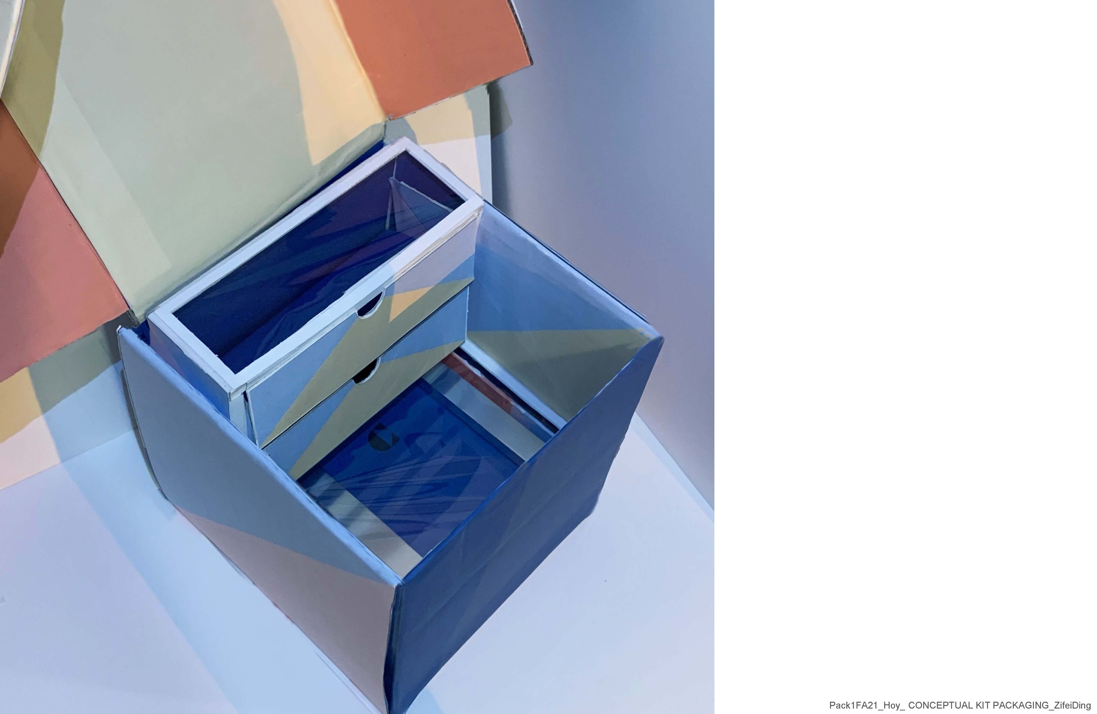
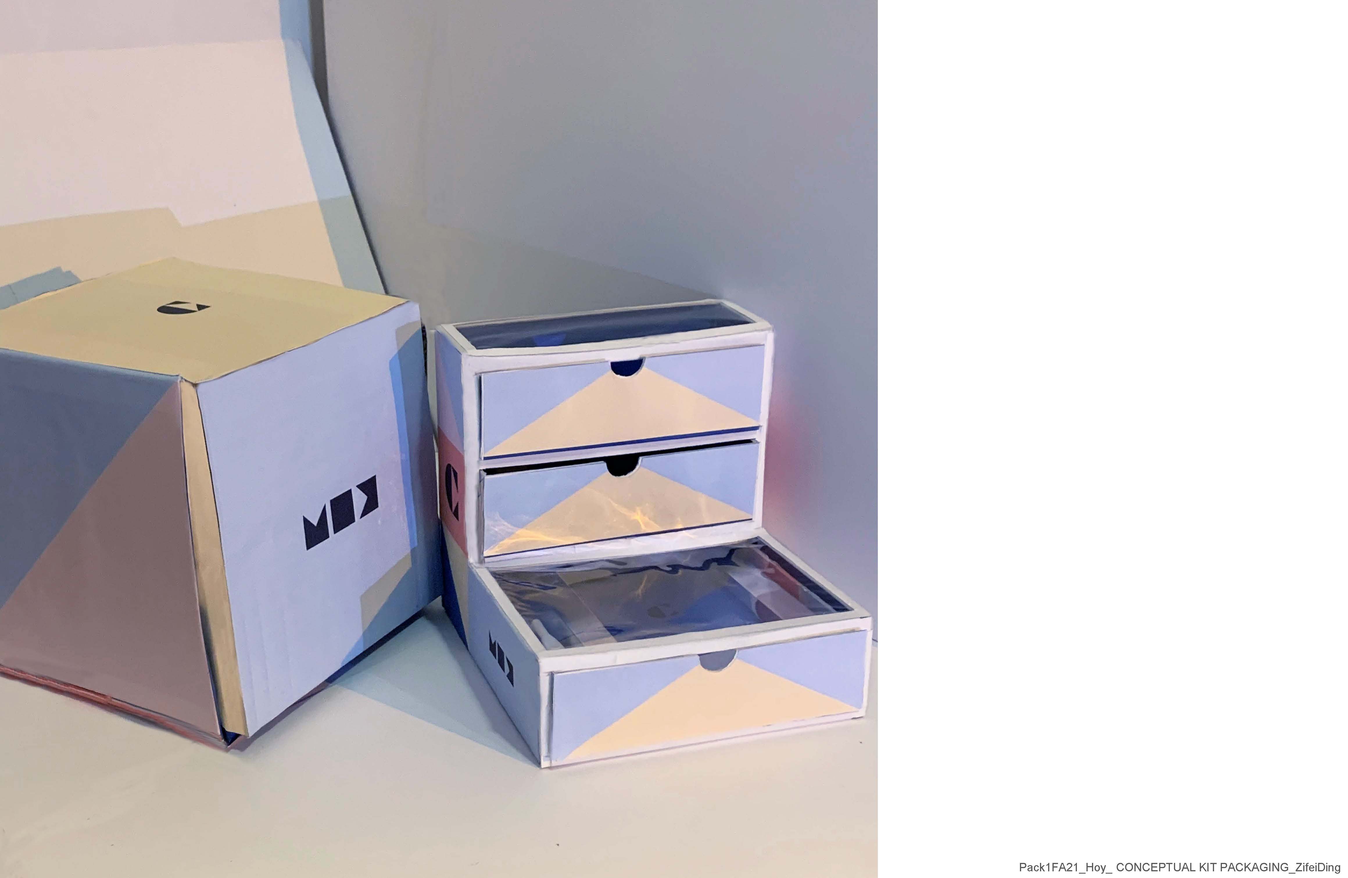
Then this is what the craft kit looks like when placed in a corrugated box
Image
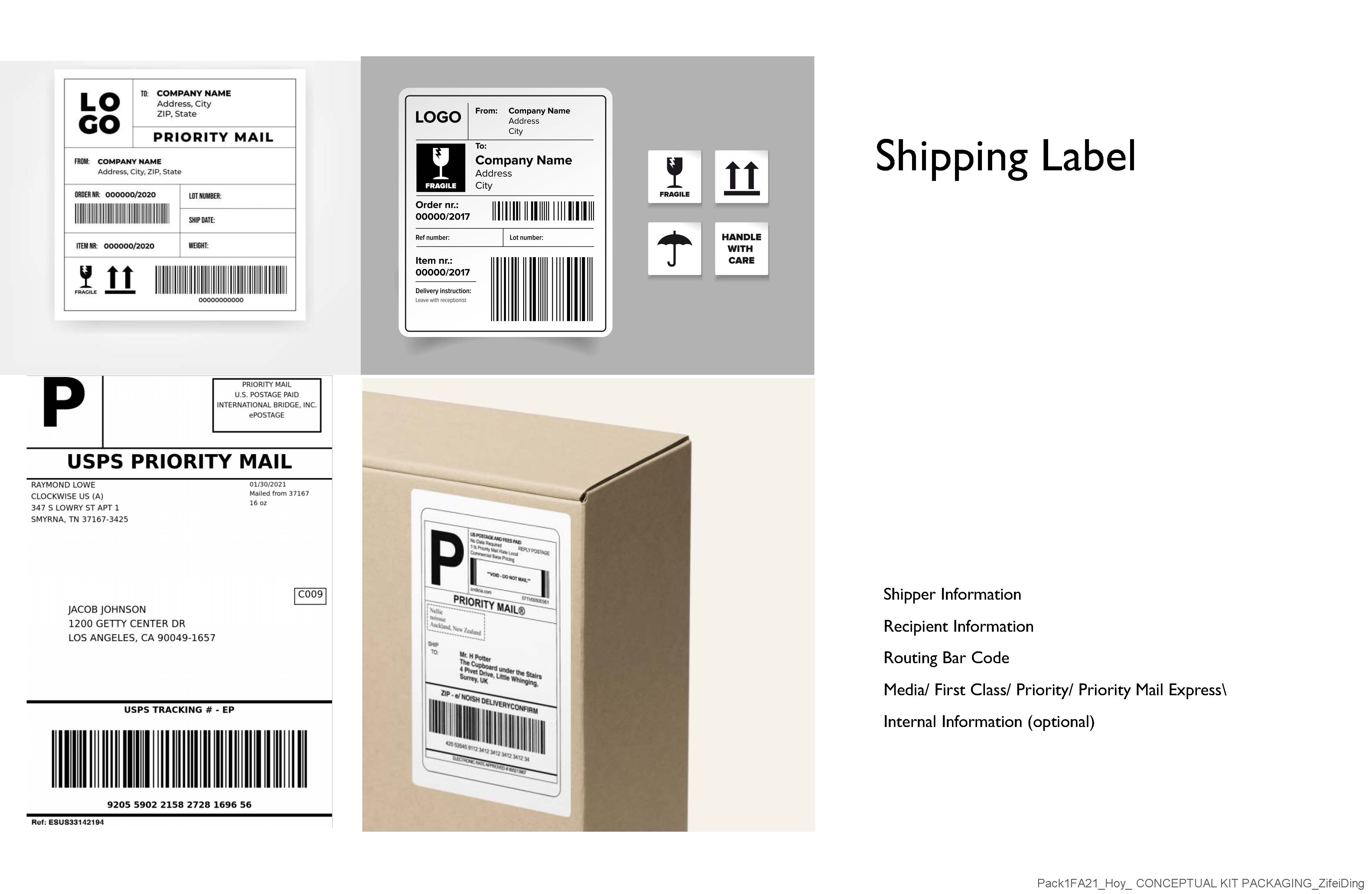
Because this product was to be shipped, I felt it also needed a shipping label that better matched its visual elements. Then I analyzed the common points contained on the different-shipping labels.
Image
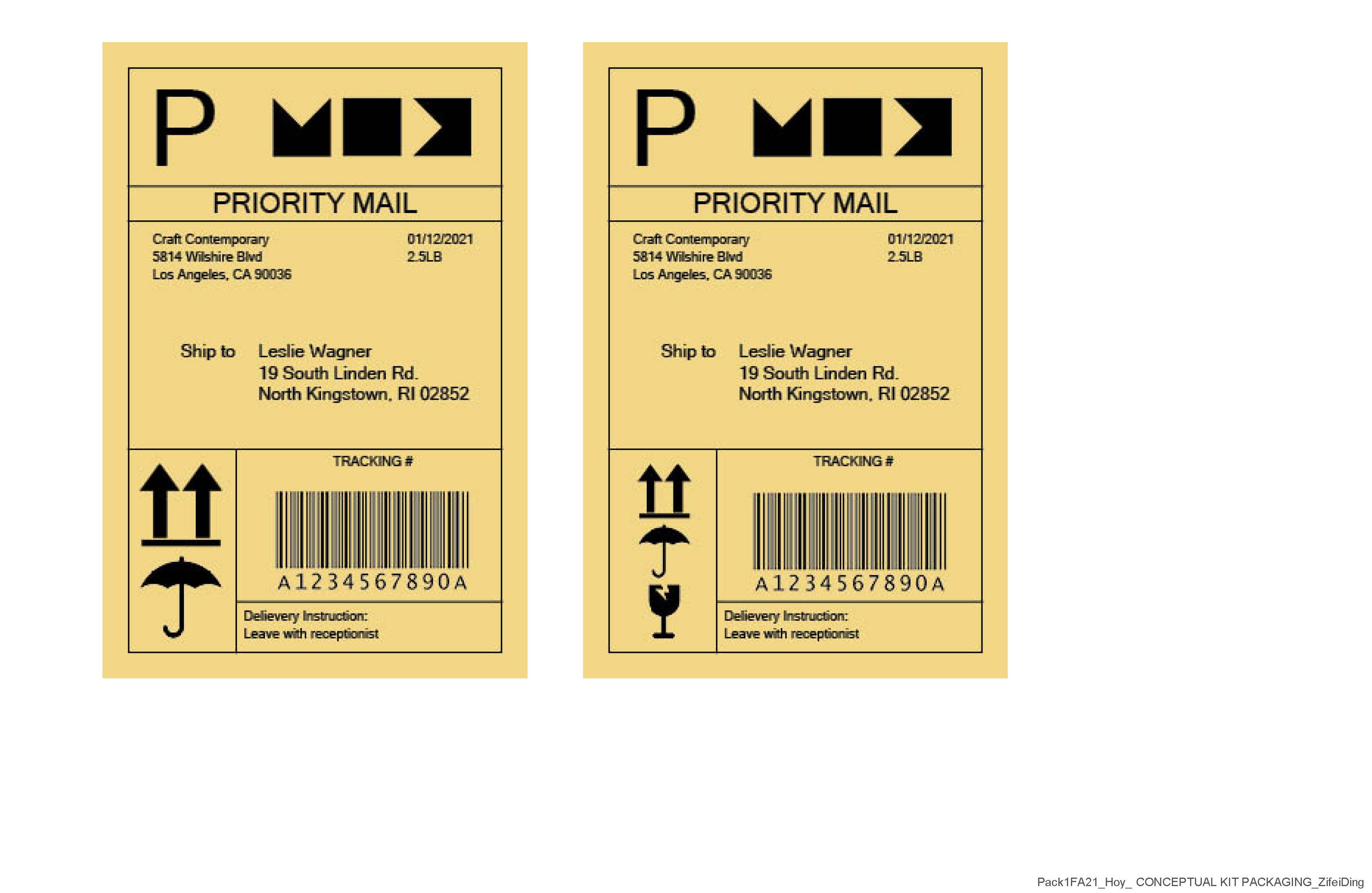
Then this is the design of my shipping label. The size of some warning signs in the lower right corner can be adjusted according to the quantity.
Image
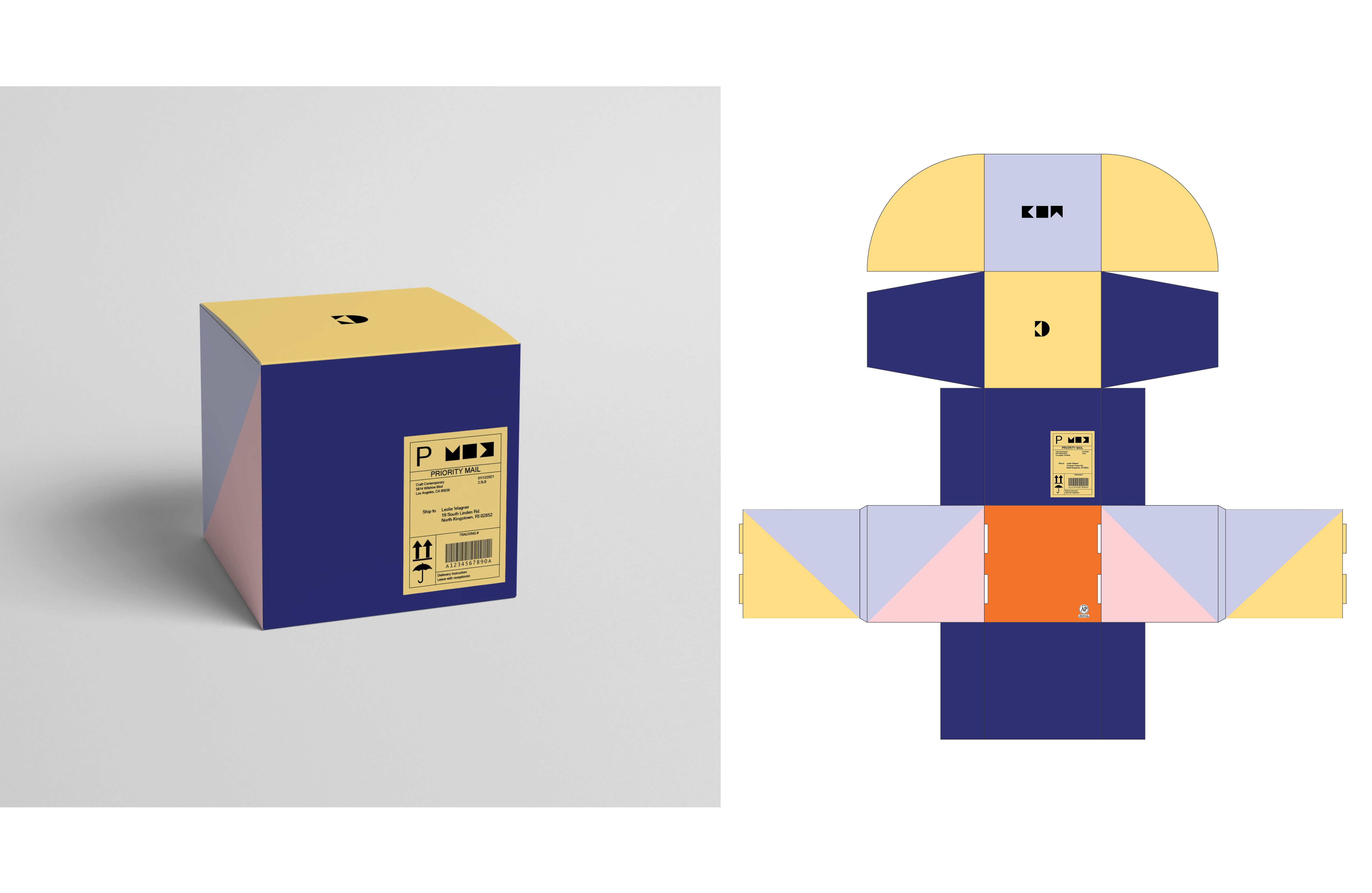
This is what a shipping label looks like when added to the corrugated box.
Image
The above is the whole content of my conceptual kit packaging project, thank you for watching.