The Coachella Valley Music and Arts Festival is a cultural landmark that sets trends with the premier music and arts festival known for diverse musical acts, large-scale art installations, and trend-setting fashion. This hypothetical project rebrands Coachella with a more youthful and inclusive visual identity. I was drawn to Coachella for its music festival energy and reimagined it as a brand that celebrates diversity, belonging, and emotional connection through color.
Process:
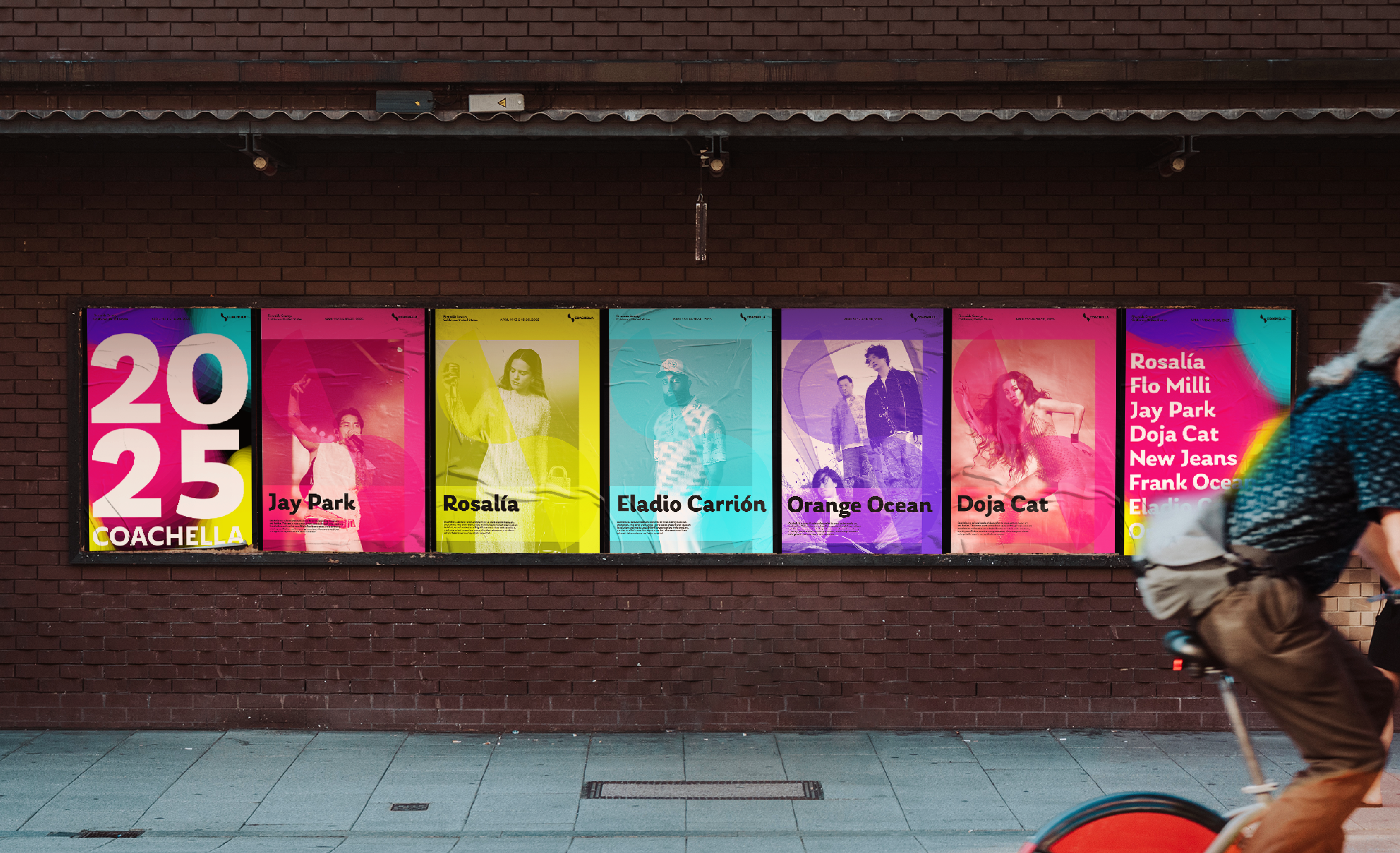
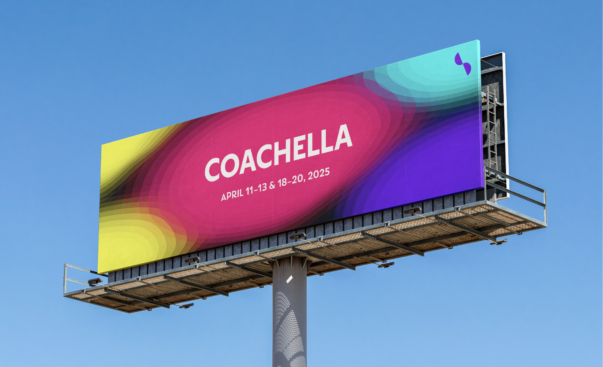
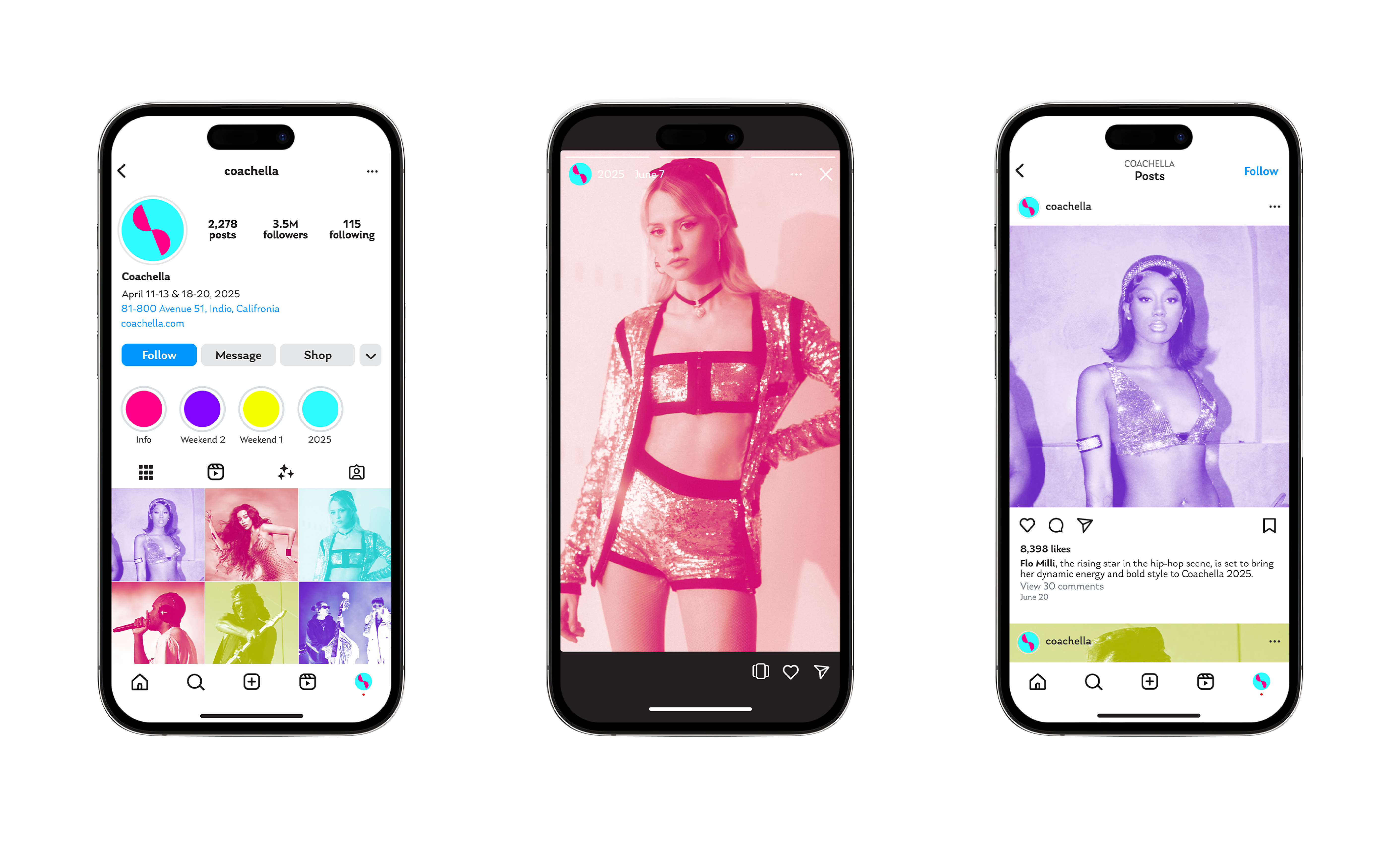
My concept is based on diversity. Coachella brings together people with different backgrounds and different reasons for coming, so I wanted to create one visual entry point that makes everyone feel naturally connected.I started with color because that is how I understand a scene. I notice color before words, so I built the palette through the relationship between desert, sky, and land, using warm and cool fluorescent tones to express emotion quickly and clearly.I designed the logo as a flexible form because the Coachella experience is always changing. It references the separate stages and also echoes a treble clef, while showing the connection between the audience, performers, and the festival itself.
Learning Outcomes:
Through this project, I learned how to translate diversity and emotional connection into a clear visual system through color, form, and hierarchy.