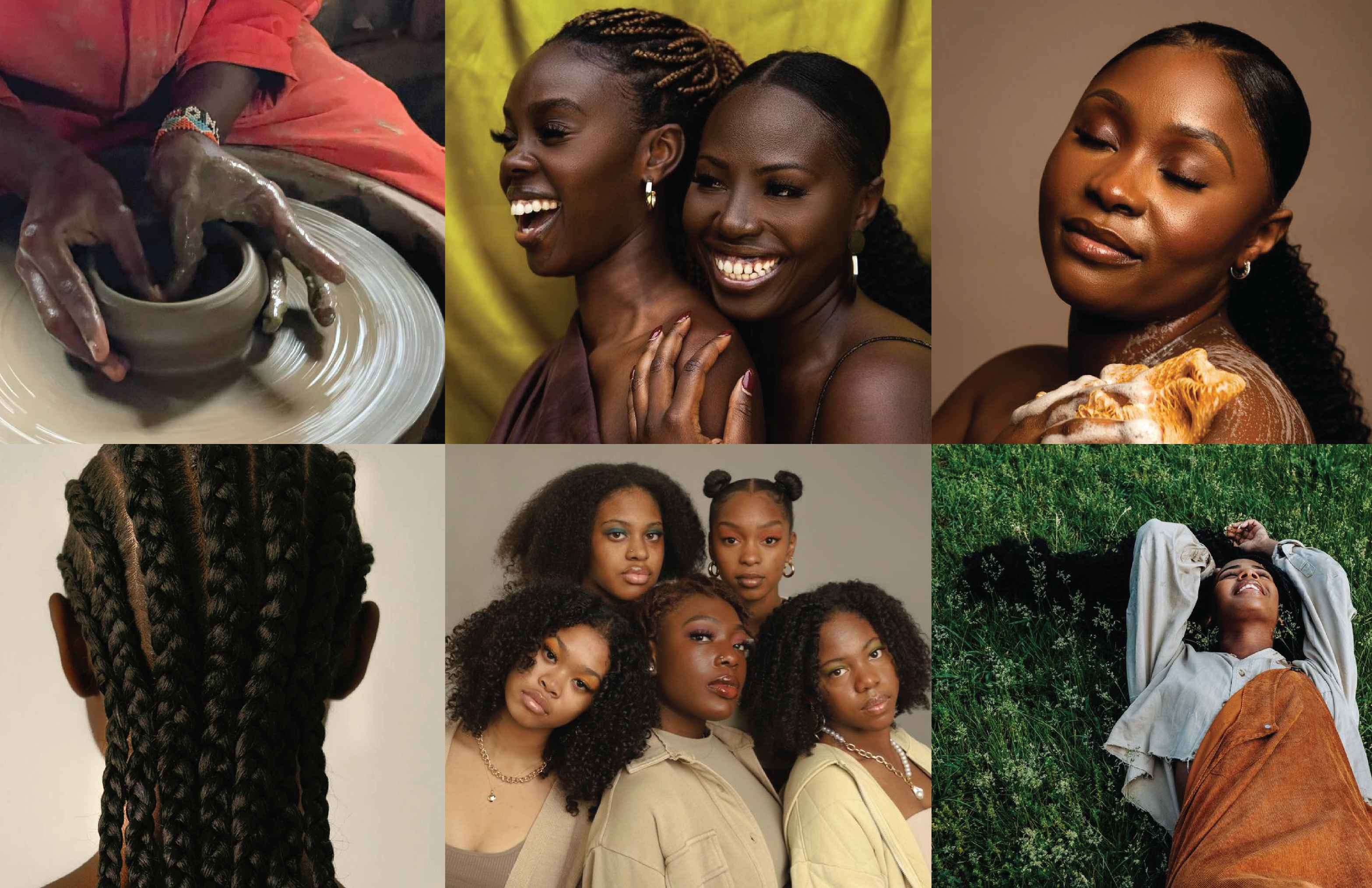
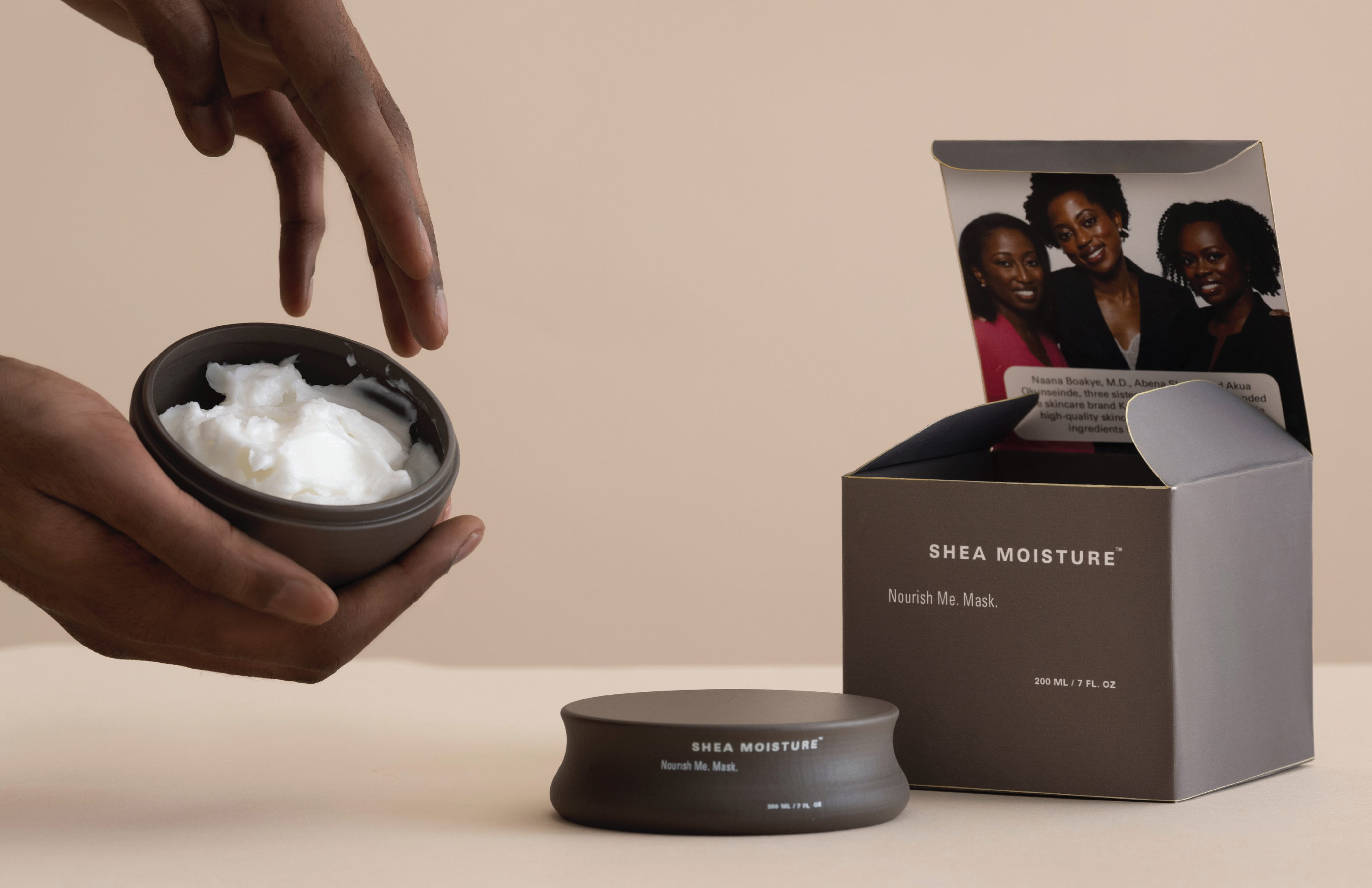
SheaMoisture is a personal care brand rooted in the legacy of Sofi Tucker, who began selling shea butter and homemade beauty products in Sierra Leone in 1912. The brand is known for hair and body care products as well as its continued investment in Black communities. This hypothetical rebrand for SheaMoisture was driven by my interest in packaging as a form of storytelling. I was drawn to the brand’s values, its origin story, and its support for Black communities, but I felt the packaging did not fully express that care. Through this redesign, I wanted to create a warmer and more emotionally resonant identity that better reflects the people the brand was built for.
Process:
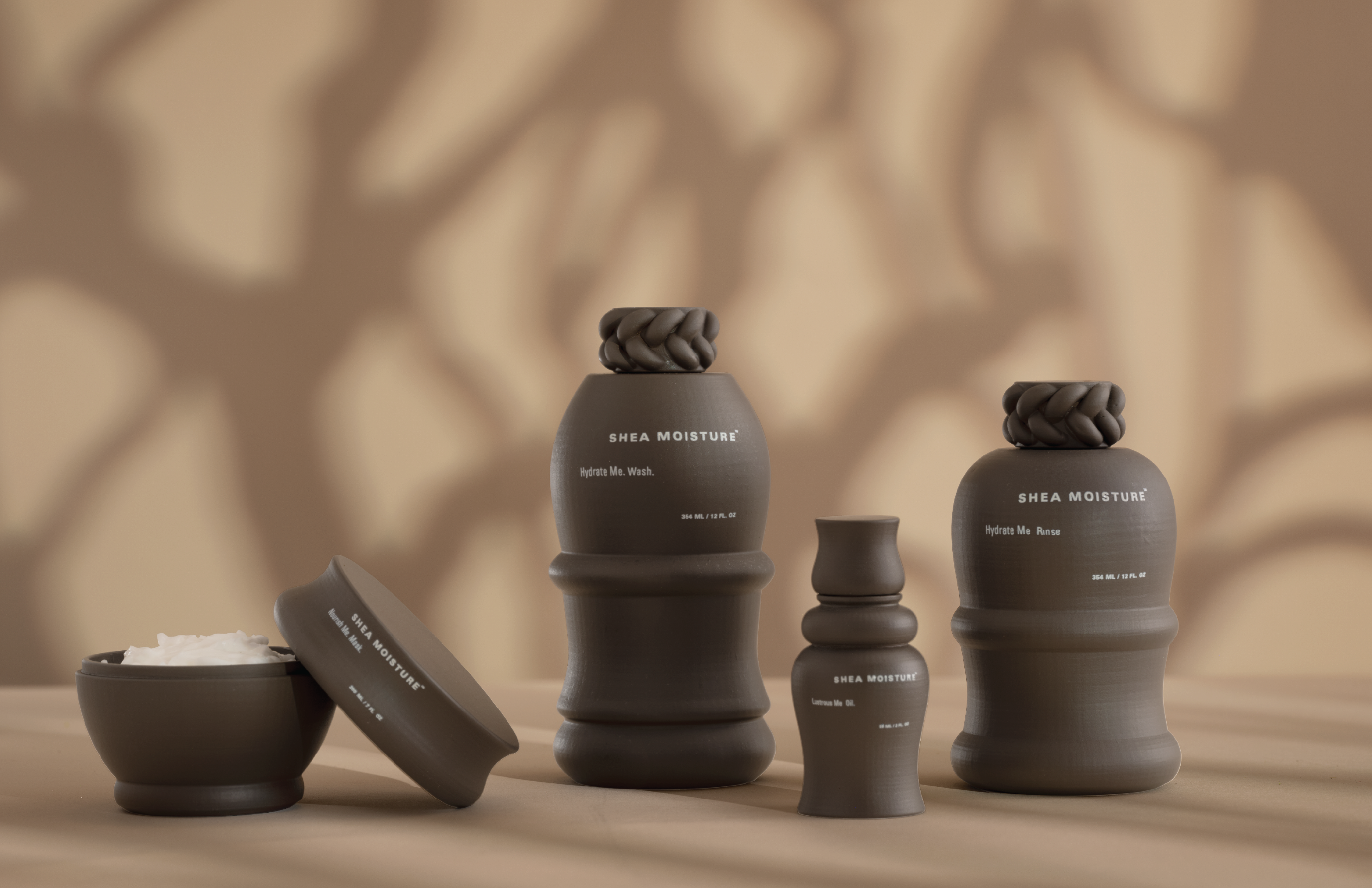
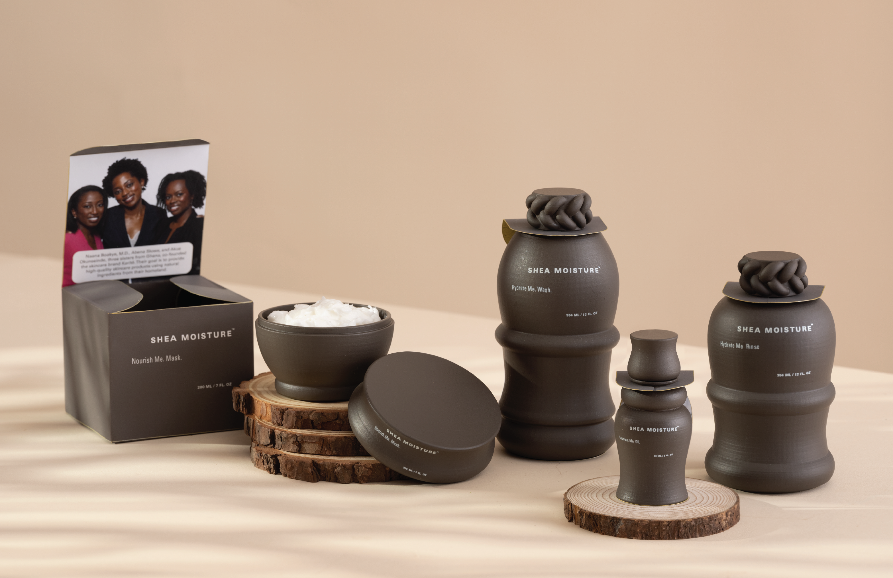
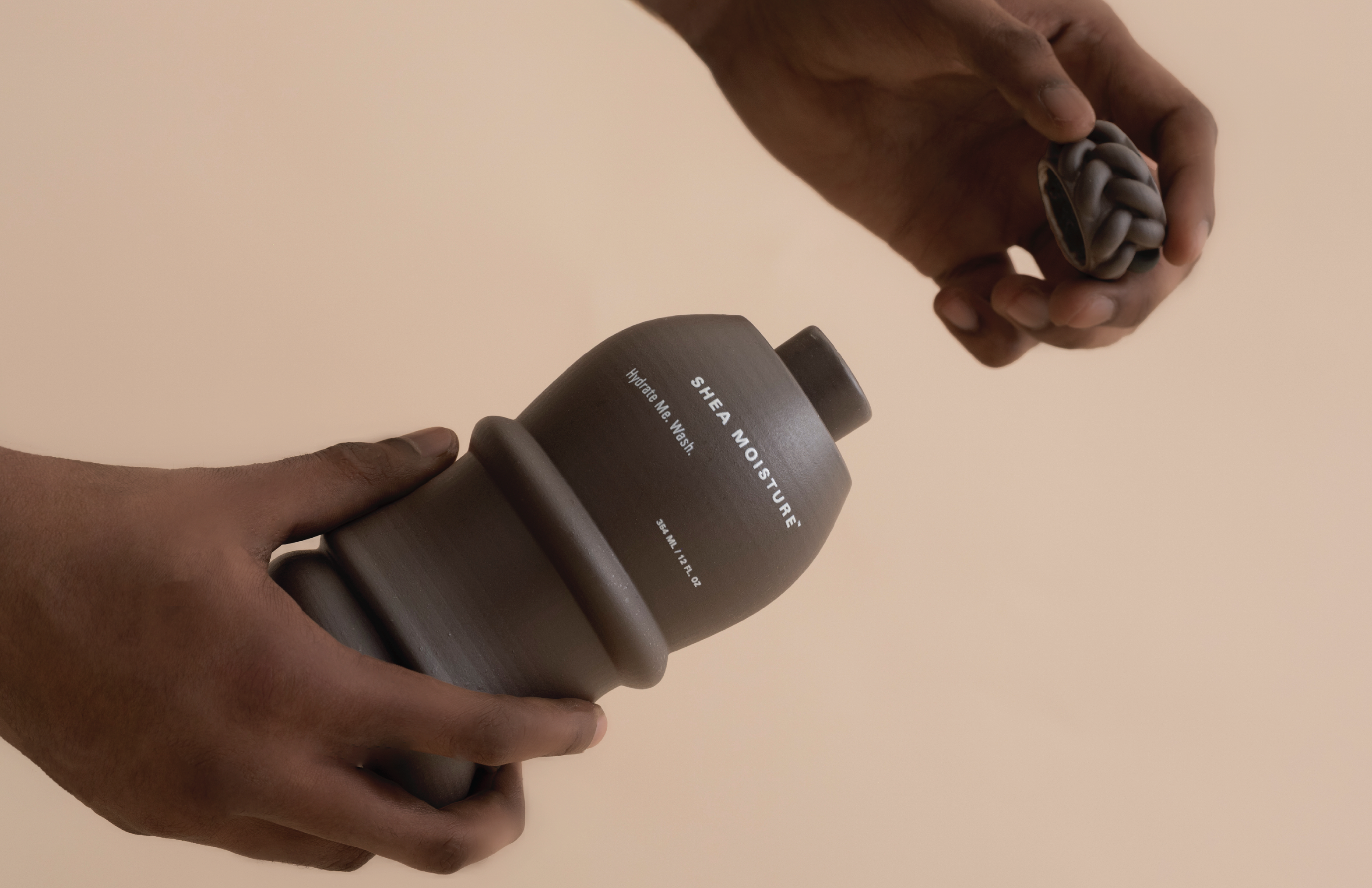
I used curves as the starting point for this project to connect hair and body. By treating hair as an important part of the body, I wanted the packaging to feel more personal, caring, and human, while setting up the bottle forms that follow. Shea Moisture is made for women—embracing all the different curves of their bodies, whose beauty speaks through texture, rhythm, and quiet strength. For me, “Every curve tells a story, of strength, memory, and care” captures the whole concept, because I was intentionally using form to express heritage, softness, and resilience at the same time.
Learning Outcomes:
This project was important to me because it allowed me to explore packaging as a form of storytelling and create a design that better expresses SheaMoisture’s care and brand values. Through this project, I learned 3D modeling, 3D printing, and the hands on process of sanding, painting, and refining the bottle form.