Image
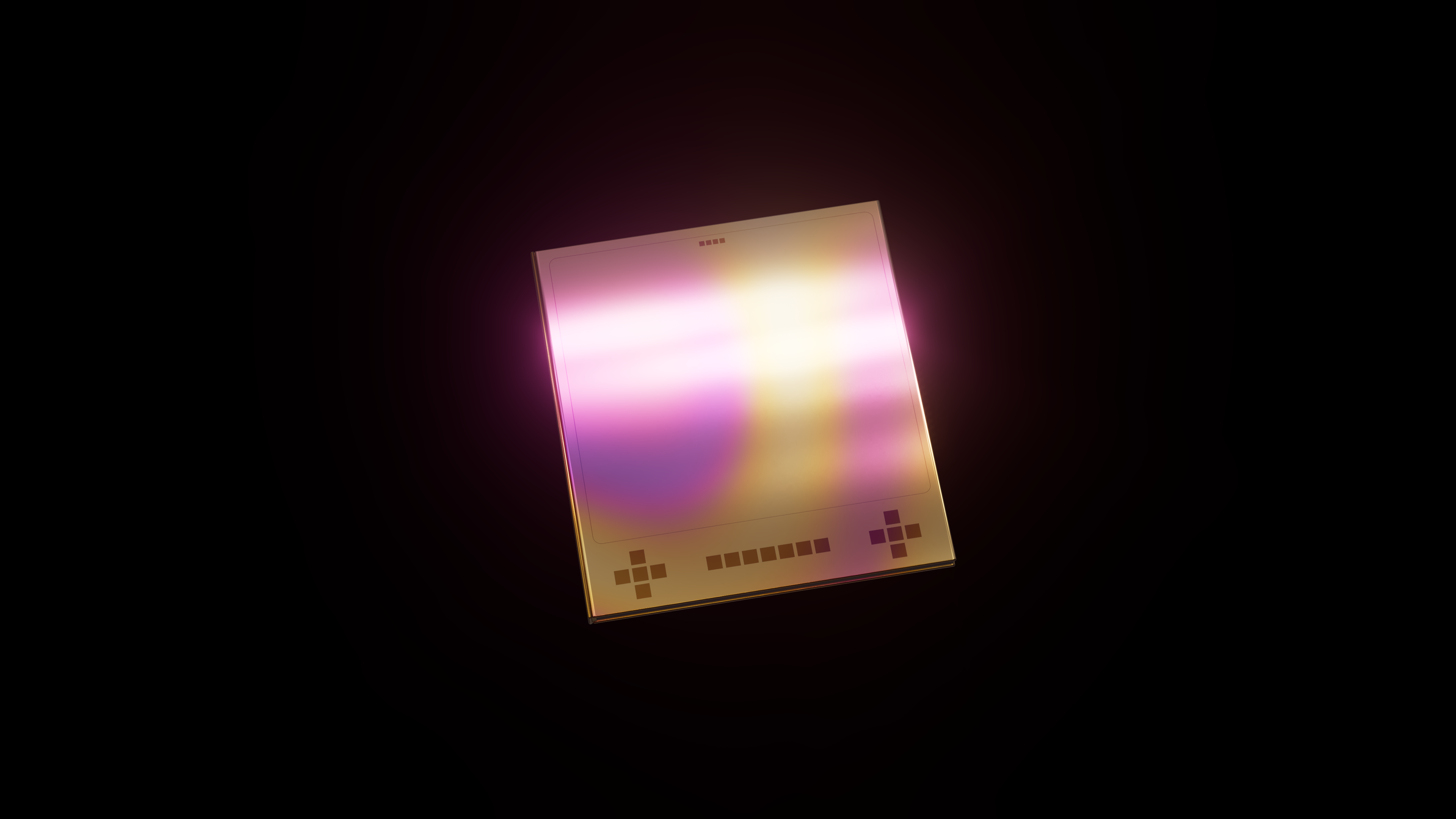
To extend the experience beyond the exhibition, I designed a book that feels like a game. Shaped like a handheld console, the cover hides the title in a “start-up screen” revealed only when opened, mimicking the act of entering a game. The back replicates a console’s layout with symbols and credits. Printed on metallic paper with a hardcover, the book has a bold, futuristic look.
Image
Image
Image

Image
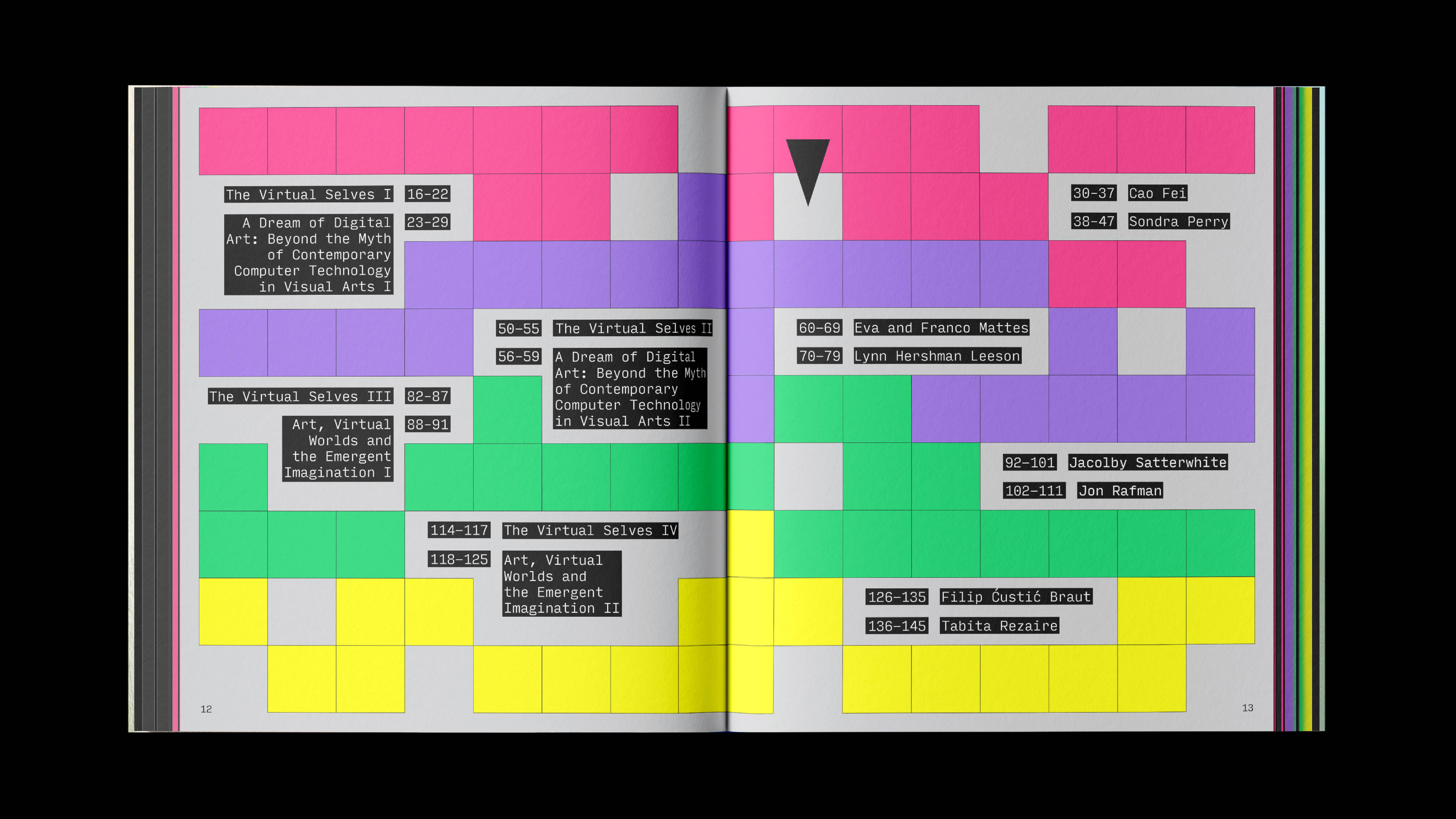
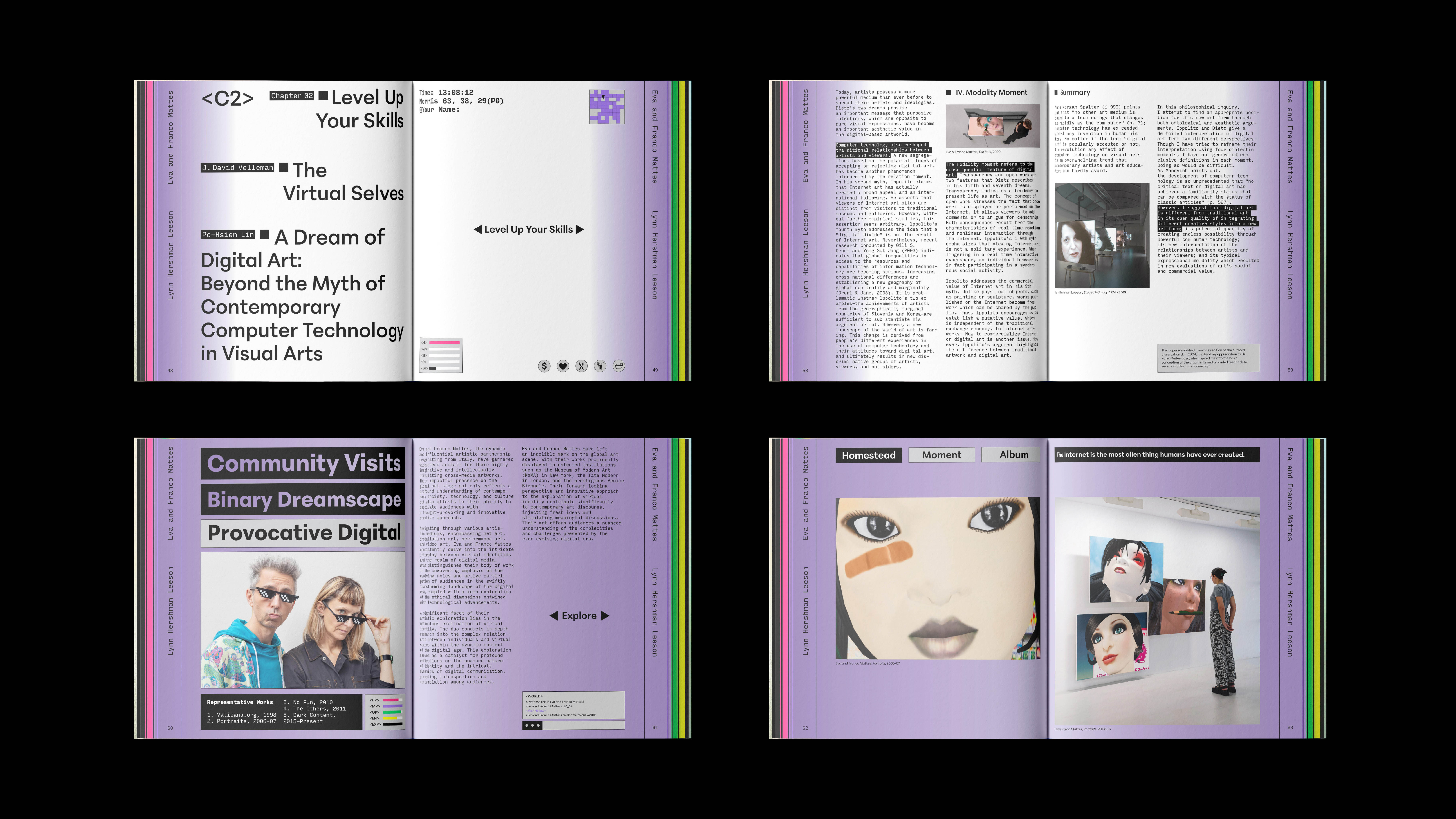
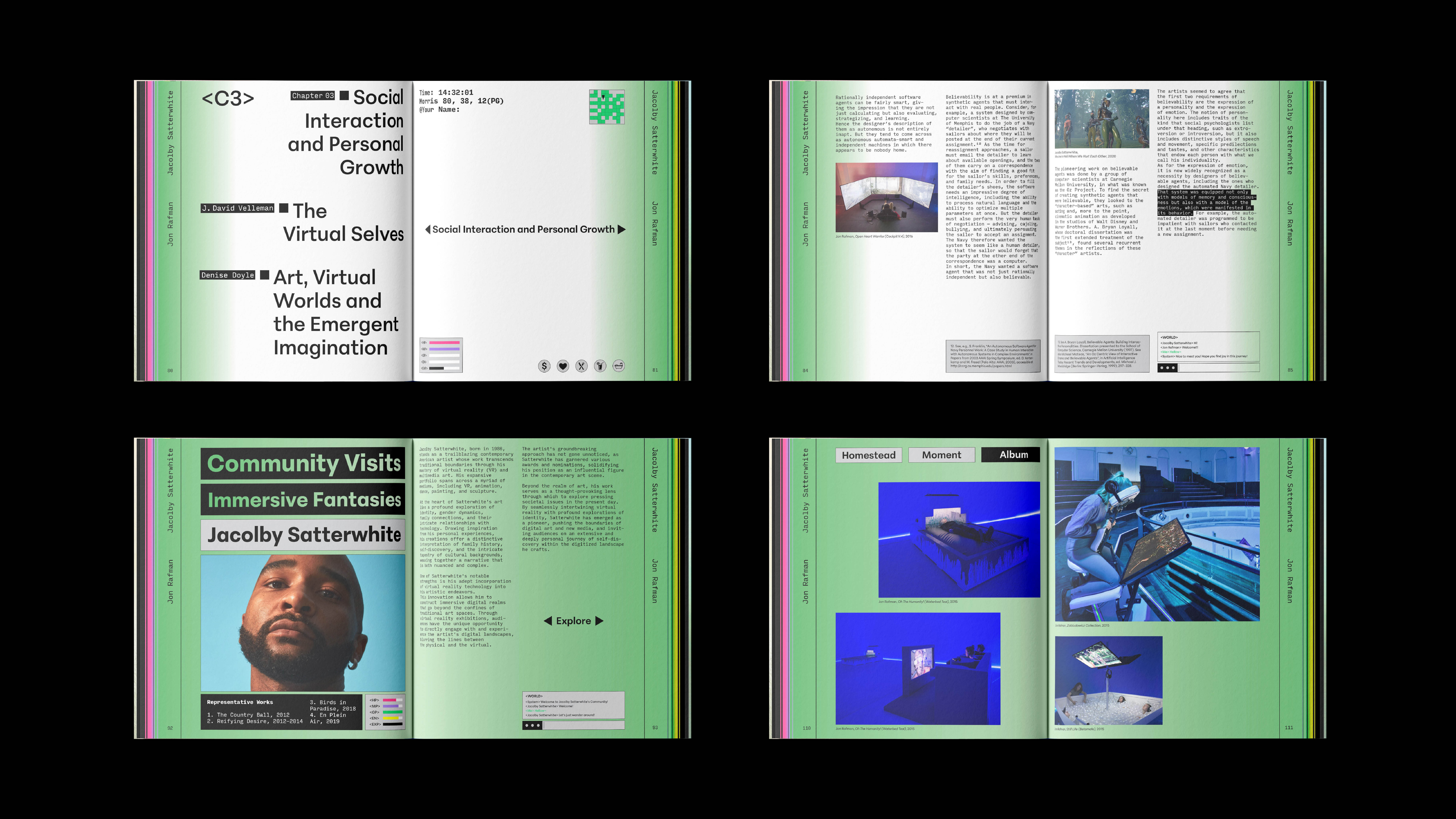
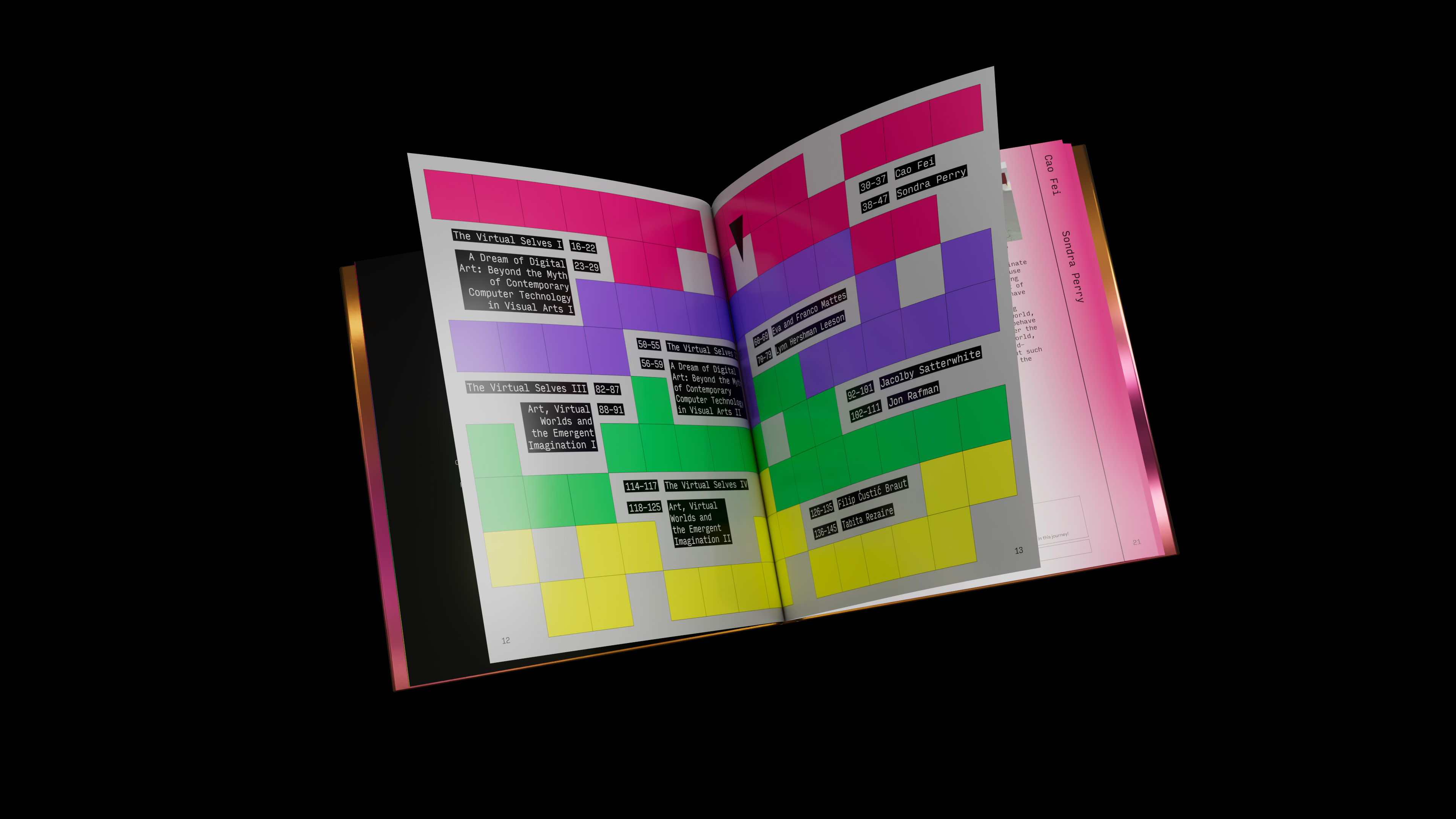
The book is divided into four chapters, featuring curated writings on digital art and a selection of works by eight featured artists. I used the Input Mono typeface to create a coding atmosphere, and use gloss paper to mimic screen textures. The table of contents is designed as a game map, with artists appearing as characters.
Image

Image
Image
Image
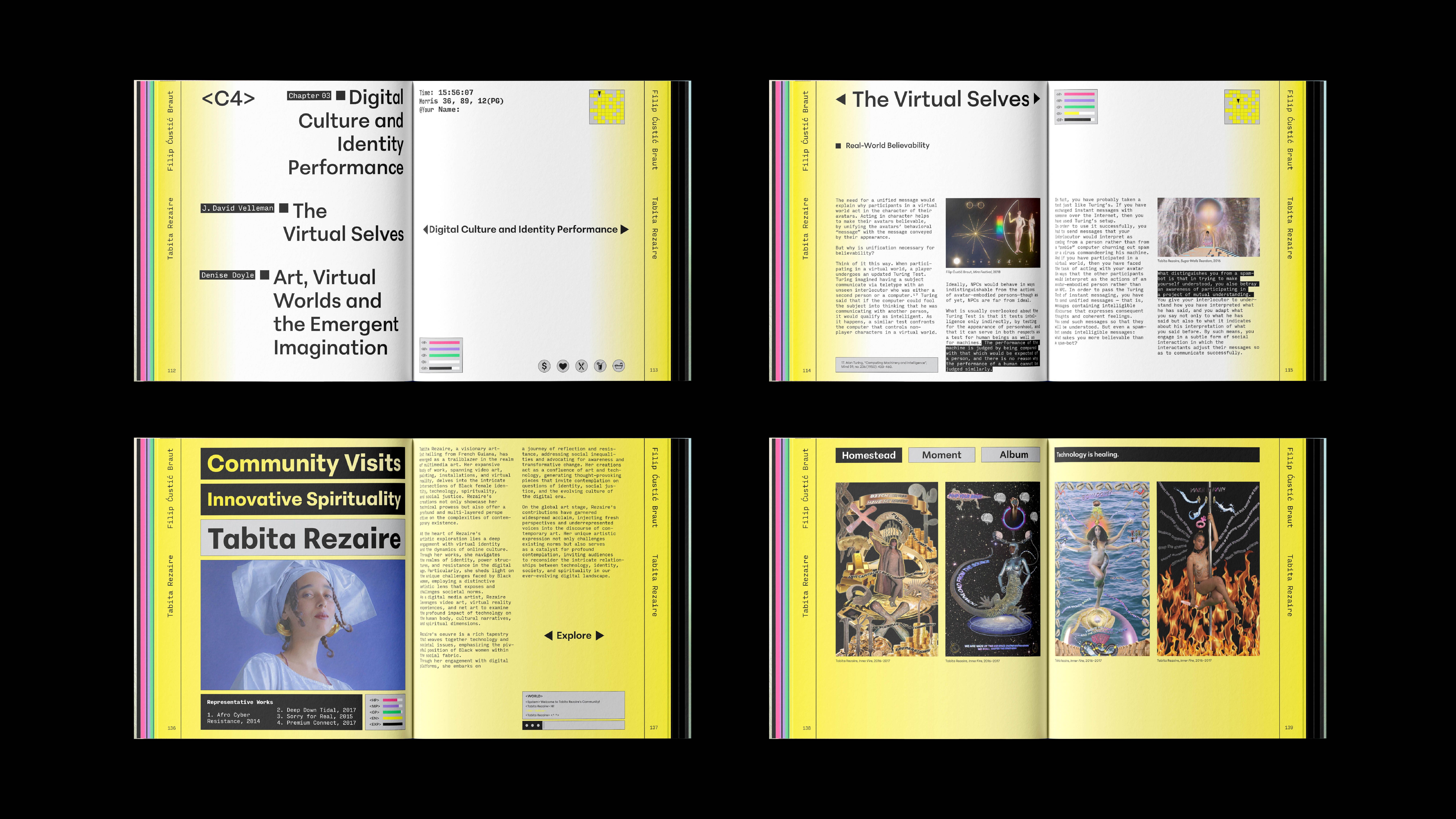
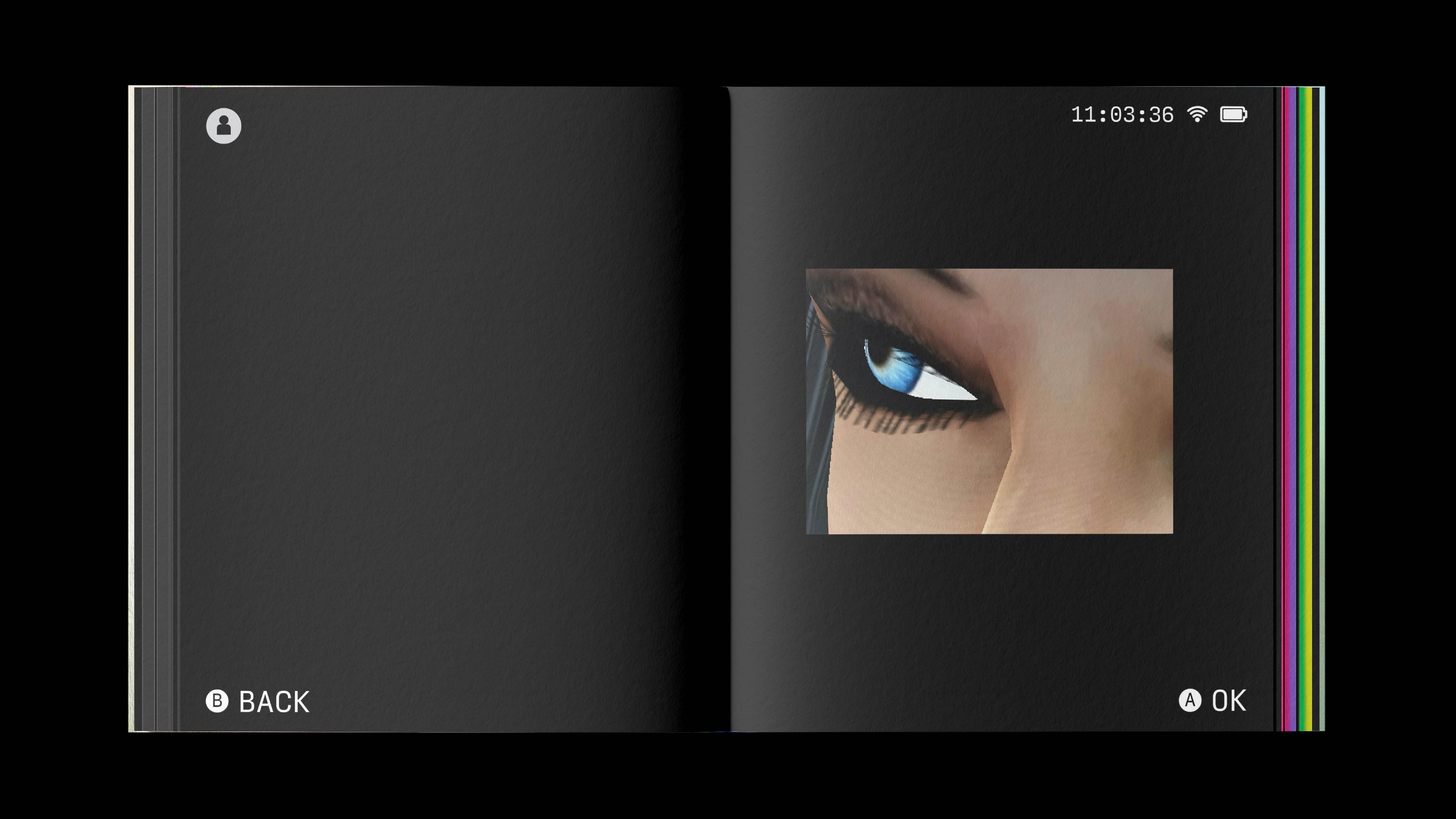
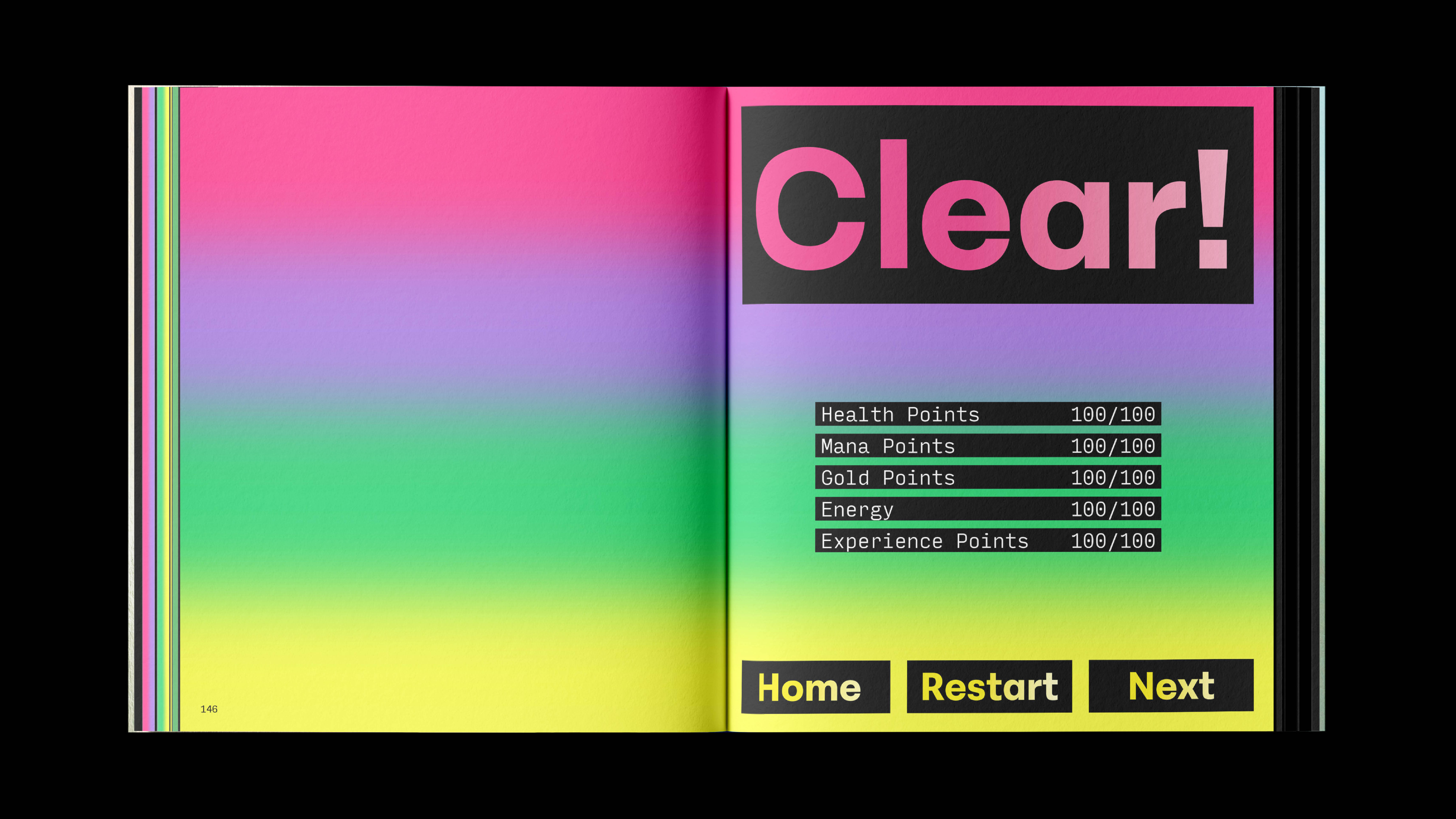
Staying true to the “game” concept, every design detail is infused with digital aesthetics. Each chapter includes game elements like HP, MP, and mini-maps, turning reading into an RPG game adventure. At the end of each chapter is an artwork showcase inspired by “home system” design—inviting readers into the virtual communities that the artist created.
Image
Image
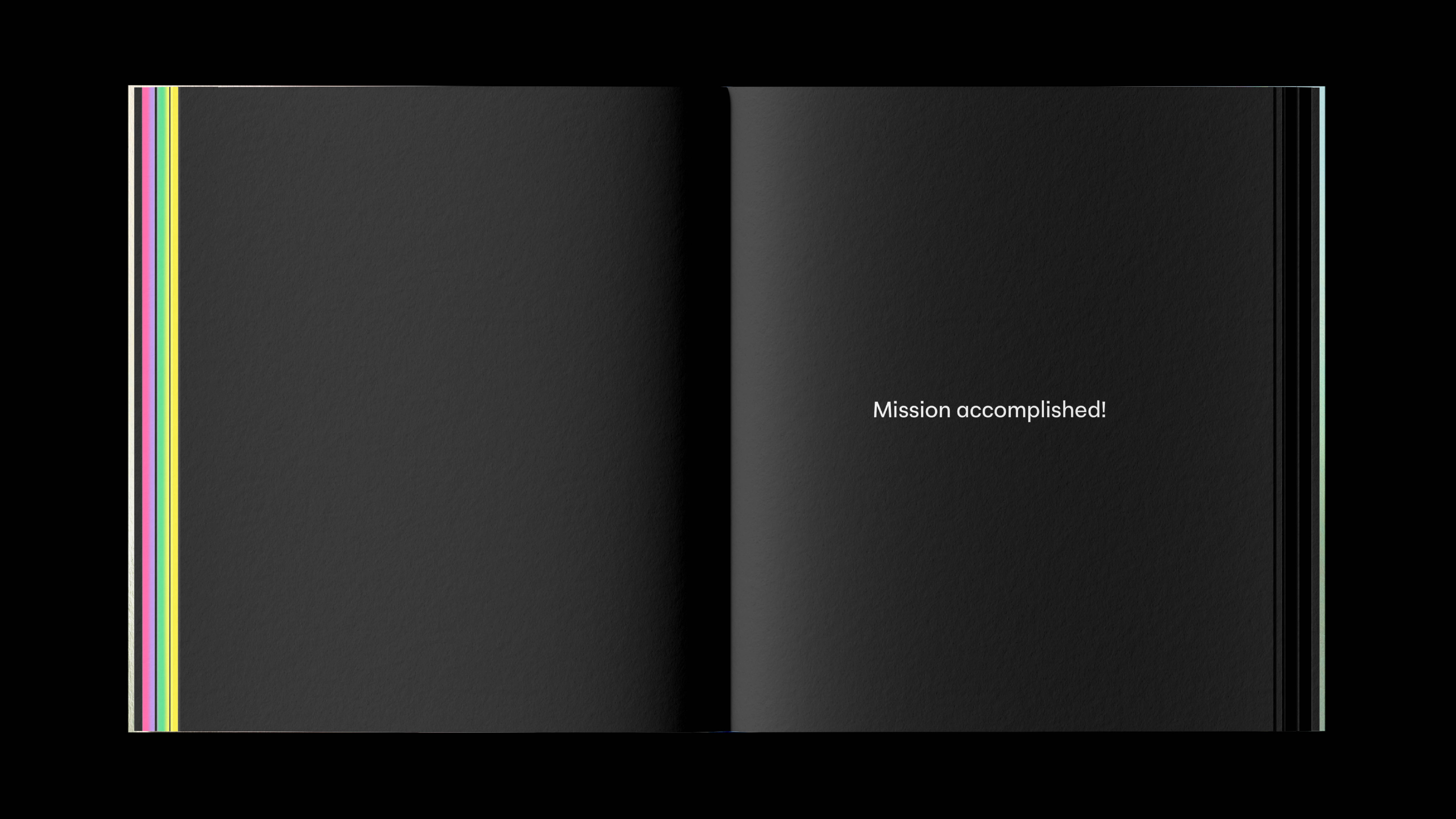
The book closes with a “Mission accomplished!” screen, bringing this virtual journey to a ceremonious end.
Image
In this book, reading becomes a game, and identity is reprogrammed. Each page is an exploration and each chapter is a journey toward virtual freedom.
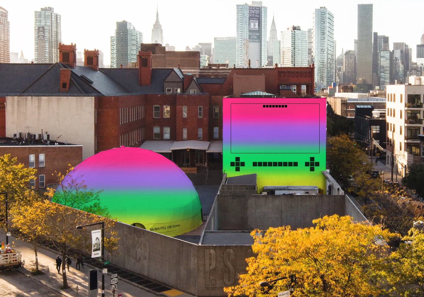
Image
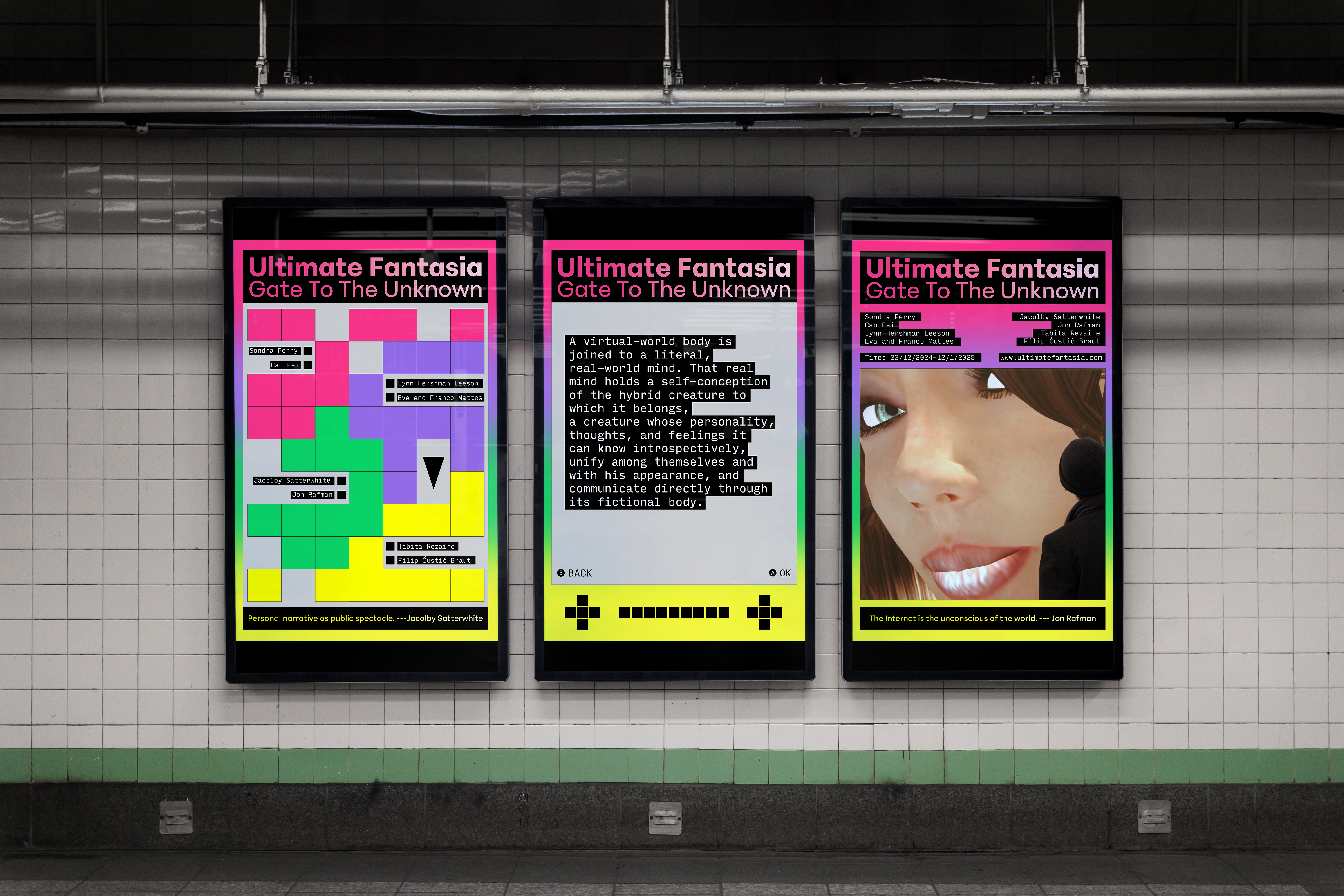
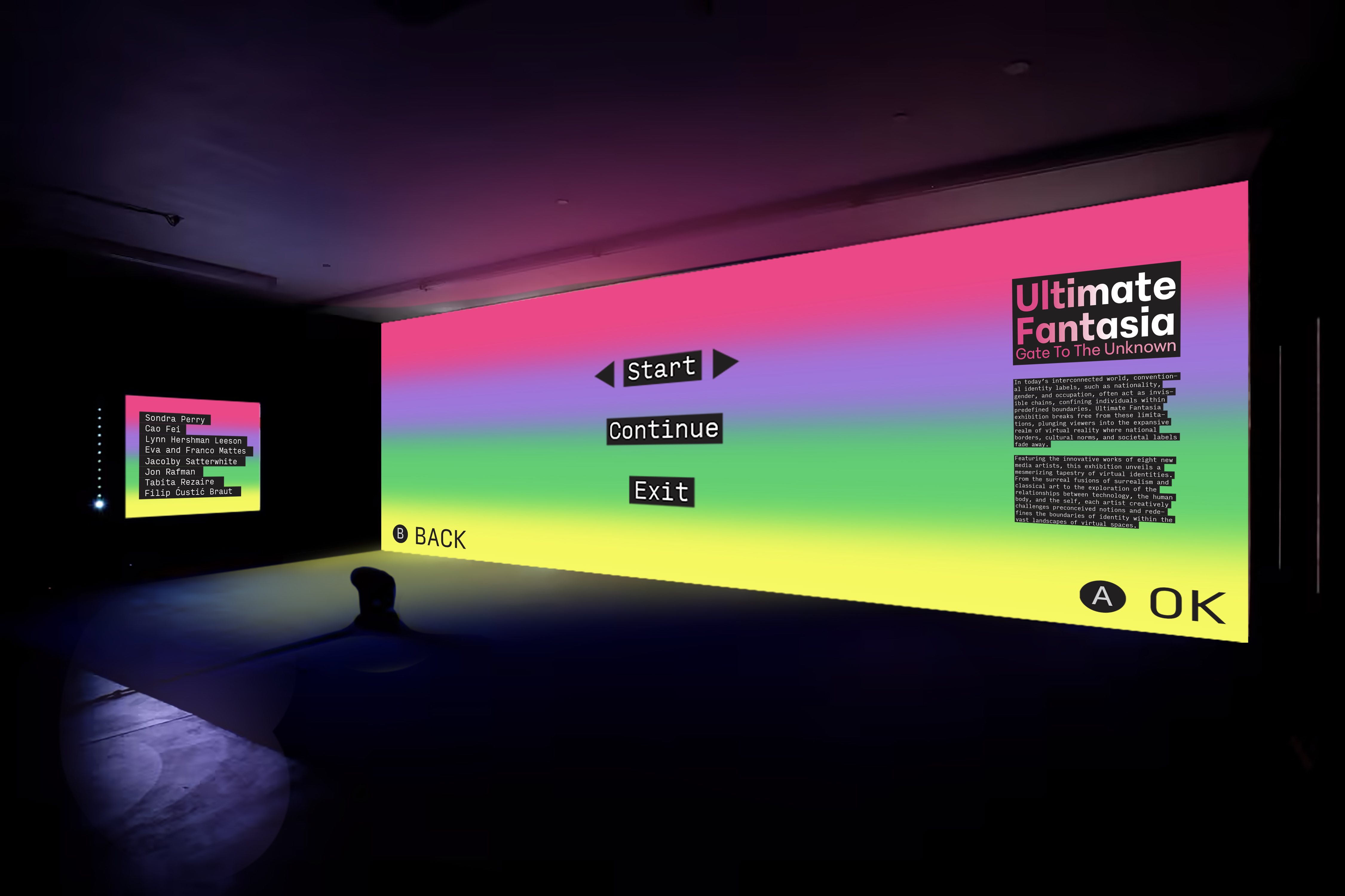
I used gradients and neon tones to emphasize interactivity and a sense of futurism. The poster designs draw inspiration from handheld console layouts and retro game interfaces. Extending this visual language to the exhibition space, I transformed the building into a neon-lit environment that feels like a game loading screen—blurring the line between reality and simulation.
Image
Image