MFA in Graphic Design - 2 Yr Path — Graduate Graphic Design
Course:
Graduate Thesis
Faculty:
Brad Bartlett
Term:
2026 Spring
Collaborators:
Daniel Marsh, Roy Tatum
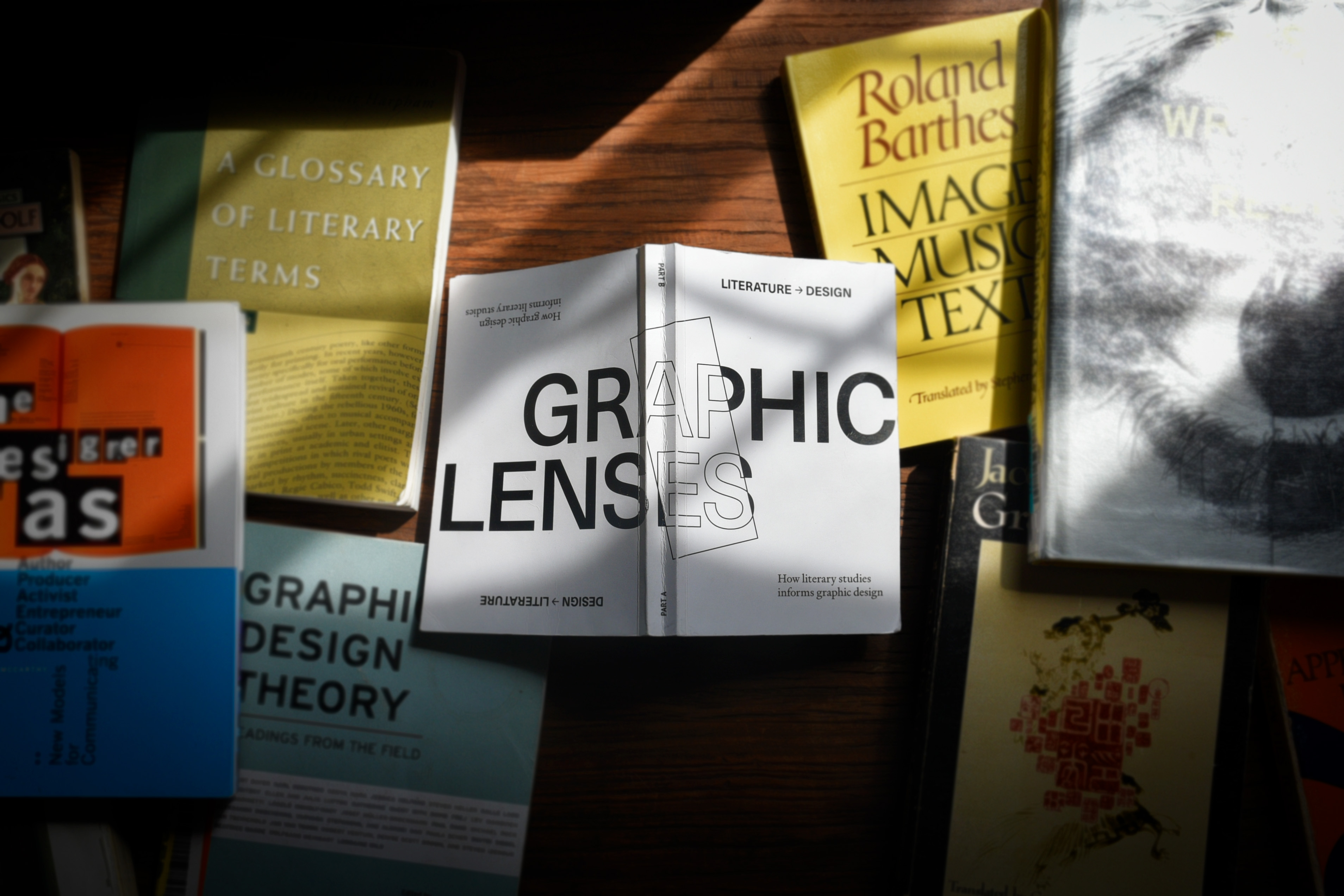
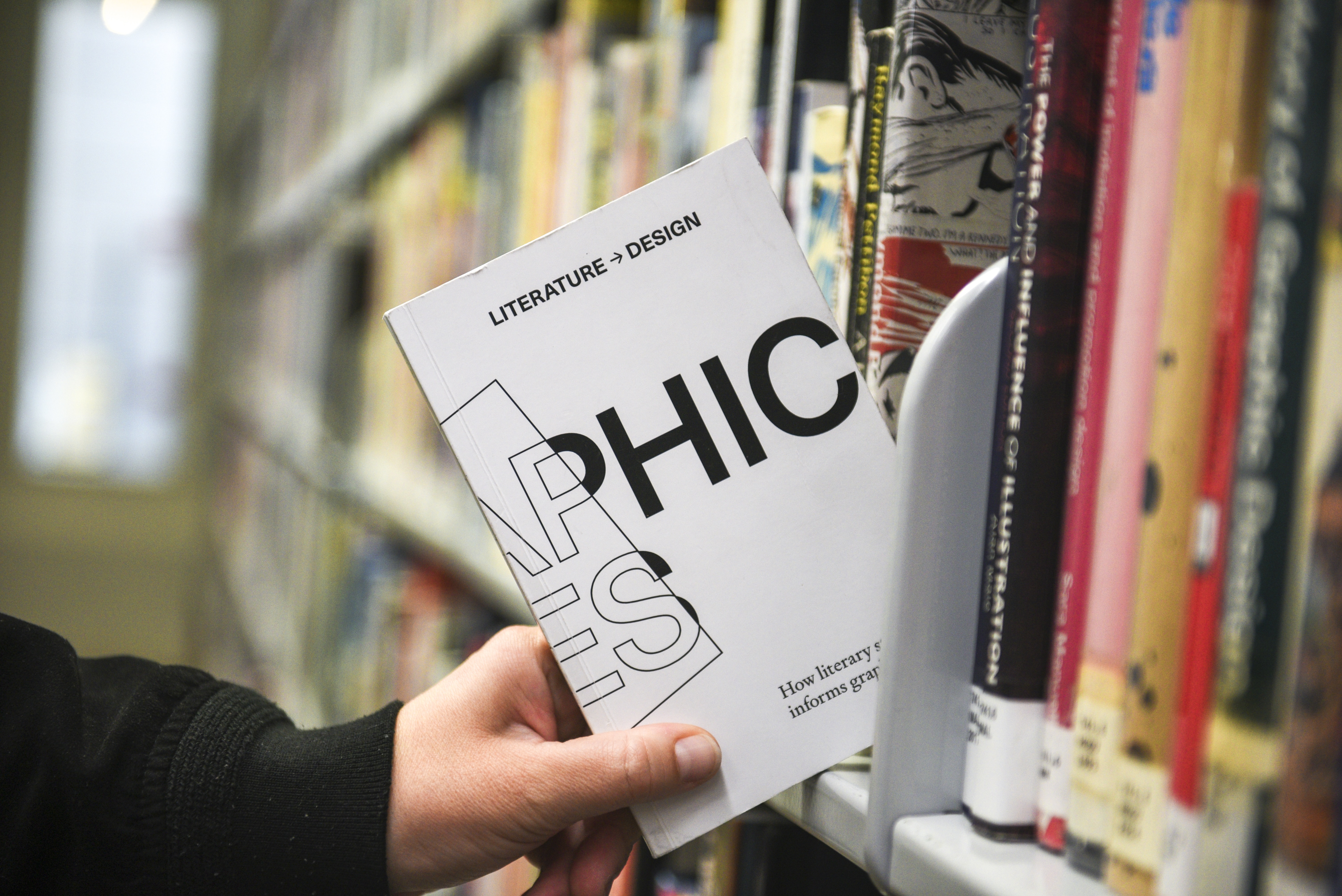
Graduate Thesis: Graphic Lenses
In my undergrad studies in literature, I was trained to identify how meaning is constructed, analyze it through multiple critical frameworks, and articulate why and how a work does what it does. When I entered graduate school for graphic design, I encountered robust frameworks for form. But none for meaning.
Then I noticed it outside of school. Visually striking design abounds, but scratch the surface and there's rarely deeper conceptual work at play. The question became an obsession: if graphic design is the union of word and image, why are the words so often an afterthought? If writers and critics have centuries of robust frameworks for understanding how written communication makes meaning—why does graphic design have no equivalent?
Graphic Lenses adapts four pillars of literary study—literary devices, genre, critical lenses, and rhetoric—into a practical framework for design practice, giving designers a critical vocabulary for what their work is doing: not just how it looks, but how it reads, and for whom. The same tools that make stories resonate translate directly: metaphor to emphasize brand values, the conventions of horror to power an anti-smoking campaign, an ecocritical lens to diagnose greenwashing in packaging, rhetoric to make a compelling design pitch. The translation felt less like adaptation and more like recognition. These disciplines share more fundamental DNA than either has acknowledged.
The final deliverable is a two-sided book: one side adapts literary methods for design, the other demonstrates how design offers new tools for literary analysis. You can't read both sides without turning the object over. The form performs the thesis. A companion website hosts live tools from the book.
Graphic Lenses argues for literarythinking as the missing counterpart to design thinking—already at work in practice, but waiting to be named. The result expands the discipline's central question from "does it look good?" to "what does it mean, what is it doing, and for whom?"
Process:
The research for Part A is grounded in M.H. Abrams' Glossary of Literary Terms and Donald Keesey's Contexts for Criticism, read alongside practicing design critics Ellen Lupton, Michael Rock, and Rick Poynor. The book's glossary structure was the right formal solution: comprehensive without being linear, usable as both reference and curriculum. Over 350 pages, theory is tested through practical examples that put literary concepts in direct contact with design problems.
Part B documents various case studies and live tool prototypes that use graphic design methodologies to understand language in new ways. For example, Pronouns uses Processing to place a black box over every male pronoun in a seminal literary studies text, making visible how the default assumption of a male subject operates in silent exclusion across academic writing. 95 Weeks makes media bias visually legible through pattern rather than verbal argument. A three-by-six-foot banner puts all six versions of Whitman's "Song of Myself" in conversation, each revision highlighted in color, making the poem's evolution visible as a graphic object.
Learning Outcomes:
The most significant outcome was discovering that the exchange between literary studies and graphic design is genuinely transformative, and not a one-way translation, but mutually beneficial. Graphic Lenses opens a way of practicing and critically analyzing design that is conceptually deep, visually compelling, accountable, and intellectually rigorous. The most unexpected discovery was how much the reverse exchange revealed: that design's visual methodologies are not supplementary to literary analysis, but illuminating in ways text-based analysis alone cannot achieve.
This project confirmed that graphic design has the same intellectual sophistication as the disciplines it is too often measured against—and that the framework to prove it has been sitting in literary studies the whole time.